My task is to organise photographic and copy content that will be used in a publication entitled "A-Z: Type in context". My publication will explore the typography specific to a particular place.
I must collect at least 26 photographs - at least one per letter. These can be from road signs, shop windows, newspapers, placards etc. For each one that I collect I must write a short passage about the context in which it was taken - where is it used and for what purpose? Is it effective? Is it easy to read? Does it communicate well?
Mandatory Requirements:
Photographs: Should be taken to a reasonable standard although there could be restriction due to accessibility of camera. Good photos can be achieved using phone cameras, as long as they are taken using the highest resolution possible.
Copy: It should be written in the 3rd person consistently using formal language
Initially I struggled to think of a location to take my photos in. I wanted it to be personal and relate to something that I could engage in, as typography is an area I am not particularly interested in. I decided to find letterforms within my bedroom, as it's my own personal space and it probably has some interesting typography that I usually overlook, although I am around it constantly. As well as that I have a strong interest in packaging design, looking at typefaces that are used specifically on different items, will help me use them more appropriately.
Photos:
A


The letter ‘A’ appears on a CD
player to show the make of the brand. The purpose is to draw attention and make
people aware of the brand. The brand have created their own personalised
letterform which makes recognising the brand more effective. It is easy to read
close up, but not so effective further away.
B


The letter ‘B’ appears on a gig ticket to within the name of the band. The purpose of the type is to be bold and stand out from the rest of the text. It is easy to read due to the sharp, block, bold nature of the letterform. Because of the lack of curves the letterform could be mistaken for an ‘8’ if not supported by other letters.
C


The letter ‘C’ appears on an iPhone box, within the name of the phone. The purpose is to be clear and easily read. It is effective due to the smooth curves and simplicity within the type. It communicates clearly and the curves give it a friendly feel.
D


The letterform ‘D’ appears on the label of a curtain tie, within the name of the brand. The purpose is to highlight the brand and to be easily recognisable. It is effective at being recognisable for the brand, being playful with the type having the bottom of the letterform missing, also adds interest and attention. It is still easily read as the letterforms main shape remains intact.
E


The letterform ‘E’ appears on a book cover, within the title. It is effectively clear and stands out on the page. The italicisation helps to add delicacy which could relate to the contents of the book. It communicates an air of romance within the stroke width and transparency.
F


The letterform ‘F’ appears on a DVD case, within the title of the film. The purpose it to be bold, striking and draw immediate attention. This achieved through the hard edges and the vibrant colour. This all makes it very easy to read, although the kerning when placed next to other letters is very tight so would be difficult to read from a distance.
G

The letter ‘g’ appears as a vinyl sticker, stuck to a laptop. The purpose of it is to make a statement and stand out. It is effective due to it’s large scale and colour contrast. The thickness in stroke also has a strong visual appeal. Therefore it is clear and easy to read. Unless the letterform is recognised it’s true communication is lost, however it does help to emphasise.
Typeface: Avion
H


The letterform ‘H’ appears on a postcard, within the name of the place the postcard is from. The purpose is to make the title interesting and intriguing. This is done through drop shadow and giving the letter a 3D effect. This helps to make the letter stand off the page and create a focal point. It is clear and easily recognisable, it has become an iconic typeface.
I


The letterform ‘I’ appears on a Pepsi bottle, within the brand name. The purpose is to highlight the brand name as well as being clear and easy to read. It is effective with the consistent stroke width which gives it a friendly feel. It communicates the brand clearly with consistency.
J


The letterform ‘J’ appears on a bottle of moisturiser, within the name of the product. The purpose is to attract attention by being bold and fun. The stroke width has a handwritten feel which adds to the playfulness of the type, effectively standing out. It is clear and easy to read due to the bold stroke.
K


The letterform ‘K’ appears on the back heel of a trainer, within the brand name. It’s purpose is to clearly highlight the brand name. The letter form has a consistent stroke width which helps to improve readability. The italicisation gives the sense of movement, regarding the sports nature of the brand.
L


The letterform ‘L’ appears on the front of a camera case, within the name of the brand. It’s purpose is to clearly highlight the brand, it does this with a simple consistent stroke width. It is clear and easy to read effectively stating the brand and giving a sense of professionalism.
M


The letterform ‘M’ appears on a flyer for an event, within the name of the event. The purpose is to attract and engage the viewer. Inconsistent, shaky stroke width and boldness in the letterform capture attention and interest. Therefore being clear and easy to read.
N


The letterform ‘N’ appears on a water bottle, within the name of the brand. It has a consistent bold stroke width and is a sans-serif type, which help to improve legibility and readability. Rounded edges are relaxed and trusting which support the brands image of being safe and clean.
O


The letter ‘o’ appears sewn on to a fabric wristband. The purpose of it is to display the name of the festival. It is effective as a bold sans-serif type is used, which improves readability and legibility. Consistent stroke width is used to help the weight stand out against the patterned background. Rounded edges appear friendly and open which is in line with what a festival wants to achieve.
P


The letter 'P' appears on a flyer, within the name of the event. The purpose is to grab attention and display the name of the event clearly. It has an extremely thick stroke width and does not have a bowl in the middle of the character. It is bold and creates visual impact, the rounded sans-serif typeface also looks modern and exciting.
Q
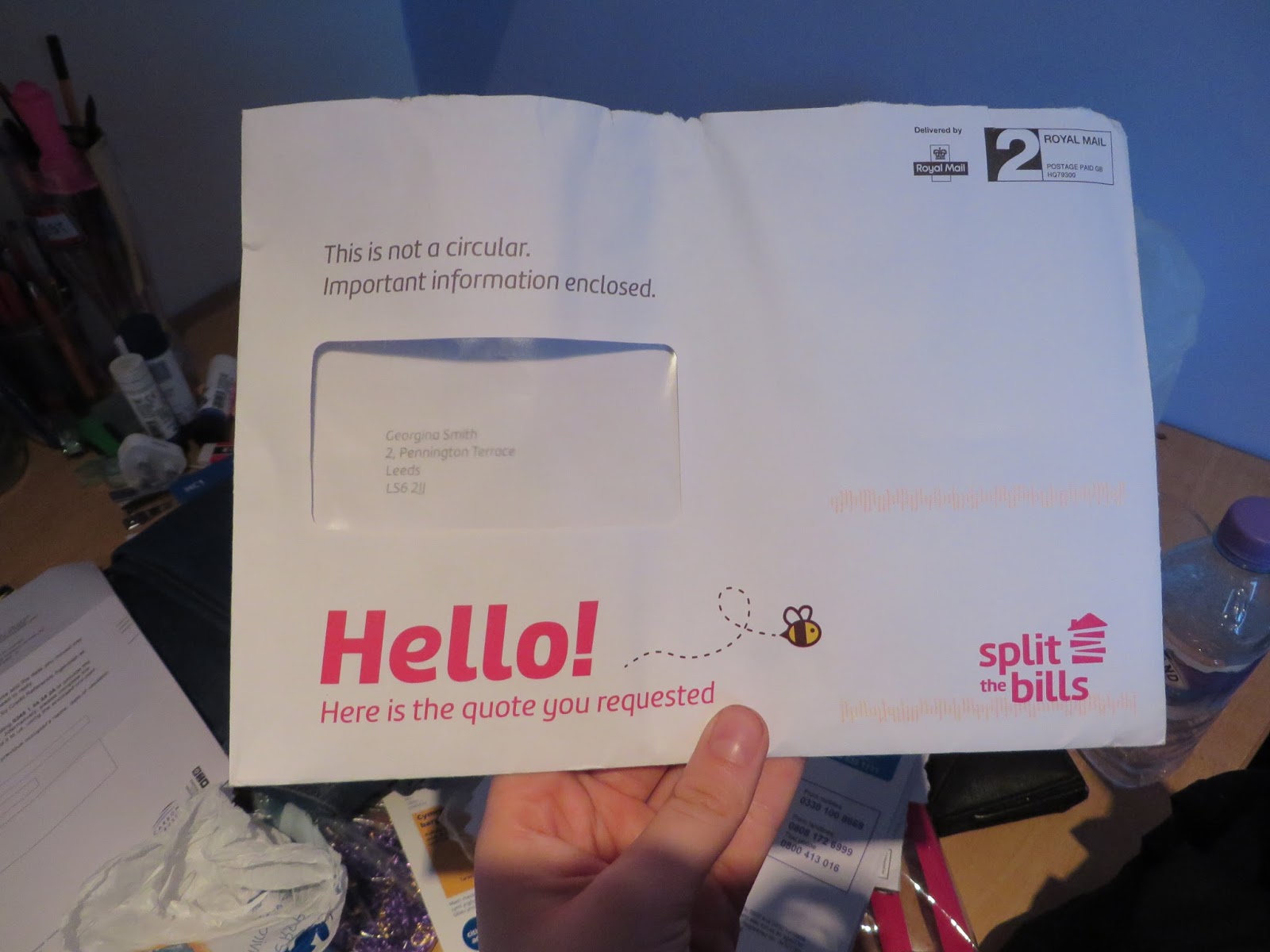

The letterform ‘Q’ appears on a letter envelope, as subtext. The purpose is to be clear and easily read. It has a consistent stroke width that has a good weight to stand out off the page.
R


The letterform 'R' appears on a bottle of dry shampoo. The purpose of it is to be decorative, fun and young, to make people want to buy the product. The line design helps to attract attention decoratively, from a distance the letterform turns into one bold shape, therefore it is legible from a distance. Although the line design can be quite harsh on the eyes.
S


The letterform 'S' appears on a flyer for stage times. The purpose is to be clear whilst also being engaging and fitting in with the theme of the festival. The serif style helps to add character and fits in with design, whilst the bold stroke width helps it stand off the page and improves clarity.
T


The letterfrom 'T' appears on a book cover, within the title of the book. The purpose is to attract and entertain. It does this through the elongation of one of the arms, to add emphasis and drama. The beveled, 3D effect also helps to highlight the letter which catches the readers attention more. U


The letterform 'U' appears on a bottle of nail polish remover. The purpose is to be simple, clear and easy to read. It does this through a sans-serif typeface with a consistent stroke width.
V


The letterform 'V' appears on a tin of lip balm, within the brand name. The purpose is to be clear and easily read from a distance. The slight variation in stroke width helps to keep it interesting and engaging.
W


The letterform 'W' appears on a packet of face wipes. The purpose is the be clear and consise keeping the design minimal and simple. A serif typeface has been used, the bracketed serifs add more to the design to engage the viewer.
X


The letterform 'X' appears on a poster for an event. The purpose is the engage and entertain, grabbing attention straight away. A black outline and drop shadow help to make the letter stand out from the background and jump off the page.
Y


The letterform 'Y' appears on a gig ticket, within the name of the band. The purpose is to be clear and stand out. Bold stroke width paired with a straight edged design, create impact and drama.
Z


The letter ‘Z’ appears on a trinket box from Ibiza. The purpose of this letterform is to be fun and engaging, highlighting exactly where is has come from. The 3D element adds to the playfulness of the type. Seeming to be aimed for a young audience, clear bold letterforms like this stand out and are easy to read. Capitalisation adds to the dramatisation of the letters to really grab attention.