Monday, April 30, 2018

OUGD603 Brief 08: Bottle

Bottle:
I've had a look for an appropriate bottle and it has been really hard to find a spray bottle. However, I have managed to find a website which does really good packaging mockups. I have found a spray bottle on there and have bought that for £3. This will make my work look a lot more professional. The mockup is a fully customisable photoshop file so that I can change the colour of the whole bottle as well as adjusting lighting and shadows.


OUGD603 Brief 08: Suncream Questionnaire

Suncream Questionnaire:

I have decided to create a questionnaire to gather some primary research and to help focus my project, finding out what is the most important aspects to consider. All of the respondents were aged between 18 - 25.


Information from responses:


What this information tells me is that people only mainly use suncream when the sun is out in hot weather. There are also a number of people which use a daily moisturiser which has SPF in it. The main factors which effect whether people buy suncream are price and a familiar brand with packaging being the 3rd highest. This suggests to me that if the packaging is strong and there is an understanding of the protective information it could be chosen over a familiar brand. Mostly people understand the basics of suncream and how long it is effective for, but it also shows that there needs to be clarity on terminology so there is a greater understanding.

Wednesday, April 25, 2018

OUGD603 Brief 08: Type and Placement

Type and Placement:
Using my sketches I mocked up possible type arrangements as well as experimenting with different typefaces.


I think that Rightous looks quite digital and might not quite reflect a suncream very well.


I like how bold and friendly this typeface is, which makes it more accessible for a wider audience.


I don't think this typefaces works as well, it makes the suncream look too upmarket as well as small type not being as legible from a distance.


I like the rounded edges of the letterforms which help to make the type friendly and open, however I am unsure whether the 30 works very well as the 3 hangs down further than the 0.


I think that Futura works the best as it has clear, round, friendly letterforms. This helps the overall design to look clean and legible.

OUGD603 Brief 08: Suncream Bottle Information

Suncream Bottle Information:
To make it easier for me to design it would be good to get all the information that I want to include on the bottle. This way, I can arrange everything appropriately and play around with placement.

Vio

Sun protection

Broad Spectrum - UVA & UVB Protection

Water-resistant - 40 or 80 minutes

I don't think I can use the UVA star rating or The Skin Cancer Foundation Seal of Recommendation because it is just a concept project so I won't include these in my design.

OUGD603 Brief 08: Initial Sketches

Initial Sketches:

I started to think about the logotype and how that could look.


I think that I want a bold, block logotype that is striking.

I then started to think about the layout of the information and the different ways that it could be displayed whilst still remaining legible.


I want to try and play around with these layouts digitally to see what they look like. I also need to start testing out different typefaces.

Tuesday, April 24, 2018

OUGD603 Brief 08: Suncream Brand Name

Suncream Brand Name:

I don't want to spend too long deciding on the name for my brand so i've tried to do a quick mind-map of potential ideas.


Im going to go for the name Vio, which is violet shortened down. This is due to the sun giving off ultra-violet light. I want to base the brand around this colour as I think it could produce a really striking concept.

OUGD603 Brief 08: Suncream packaging design (Research)

Suncream packaging design (Research):

Solait by Superdrug:


- Simple design
- Sun reference
- Bold orange
- Large SPF number
- Clear information

Piz Buin:


- Large logotype
- All type based
- Clear information
- Minimal colours - brown, orange, white

Nivea:

- Sun in design
- Blue/orange
- Central alignment
- Clear information

Hawaiian Tropic:


- Brown, orange, cream
- Holiday reference - logotype and flowers
- Smaller information
- Girl orientated

Malibu:


- White, orange, brown
- Sun reference
- Stylised logotype
- Large SPF number
- Clear ordered information

Ultrasun:


- Clean
- Bold logotype
- Sun reference
- Large SPF number
- White, orange, blue, red

Rieman P20:


- Red, orange, yellow
- Large, bold logo
- Clear, ordered information
- Simple, striking design relying on colour

Bondi Sands:


- Bright coloured bottle
- Blue, orange, white
- Large SPF number
- Sun reference in logotype

Soltan:


- Yellow, blue, white
- Large SPF
- Clear information


Looking at current packaging for suncreams they all tend to stick with the same colour palette, this could be something that I try to mix up and make different. Information is always presented in a clear ordered way, this is important and something I need to remember when doing my design. I think having a large SPF number is also important as that is one of the things people tend to look for straight away. Illustration isn't used that often on suncream packaging or used in a simplified form.

OUGD603 Brief 08: Feedback

Feedback:
I had a feedback session with a few of my peers, as I am still at an initial stage where I am collecting research, my questions are focused around that.

Do you know what SPF means?
- Most of the group didn't know what it stood
- Confusion of how SPF works / what it means

Did you know that the sun emits two types of rays and you need a suncream that protects from both?
- No, they didn't have much knowledge about this

What do you look for when you buy suncream?
- Price, main factor
- A known brand

Further feedback:
- Prefer a spray bottle
- Statistics and facts will make people take more notice
- Look at the Nivia advert which showed how suncream protects
- Look at aesop
- This has the potential to be expanded into a campaign - posters/advert/infographics/leaflet/tag
- Could use completely different colour palette to stand out amongst other brands.

This feedback was useful as I know that I need to gather more information, Im going to create a questionnaire to highlight what is important when considering the packaging design.

Monday, April 23, 2018

OUGD603 Brief 08: How to read a suncream label (Research)

Suncream (Research):

How to read a sunscreen label:
A recent study in JAMA Dermatology found that many people don’t understand how to read a sunscreen label or how the product protects the skin. Only 43 percent of survey respondents understood the meaning of an SPF value.


1. Broad Spectrum 
It’s essential for your sunscreen to offer broad spectrum protection, which means that it offers effective protection against both UVA (ultraviolet A) and UVB (ultraviolet B) rays, the solar wavelengths proven to damage the skin. UVA rays penetrate the skin more deeply than UVB, and are the chief cause of wrinkles, sagging and other signs of ageing. UVB rays damage the skin’s upper surface and are the main cause of sunburn. Both cause skin cancer.

2. Sun Protection Factor (SPF)
SPF is a measure of how long a person can stay in the sun before its UVB rays start to burn the skin. If with no sunscreen, your skin starts to redden in 20 minutes. An SPF 30 will theoretically allow you to stay in the sun 30 times longer without getting burned. But keep in mind that SPF numbers are determined in a lab. In the real world, no matter what the SPF, sunscreens start to lose effectiveness over time, so it’s important to reapply every two hours and after swimming or heavy sweating. Also note that above SPF 50 the amount of additional sun protection is negligible. The Skin Cancer Foundation recommends always using a broad spectrum sunscreen with an SPF of 15 or higher – SPF 30 or higher for extended stays outdoors.

3. Water-resistant
The terms “water-resistant” and “sweat-resistant” indicate whether the sunscreen remains effective for 40 minutes or 80 minutes when you are swimming or sweating. Since no sunscreen is fully “waterproof” or “sweatproof,” the FDA prohibits these terms.

4. The Skin Cancer Foundation Seal of Recommendation
Look for our Seal to assure yourself that a product is safe and effective. To earn the Seal, products must have their test results reviewed by an independent committee of photo-biologists, experts in sun damage and sun protection. The Daily Use Seal is for sunscreens intended to protect against brief everyday sun exposures, the kind you experience walking to the car or running errands. The Active Seal is for extended exposures such as when playing sports or at the beach.

5. Active ingredients
This area of the label, often on the back of the bottle, lists the main ingredients in sunscreens that protect your skin against UV rays. There are two main types of active sunscreen ingredients: chemical and physical. Chemical ingredients such as avobenzone and benzophenone,work by absorbing UV, reducing its penetration into the skin, whereas physical ingredients such as titanium dioxide and zinc oxide stay on top of the skin and deflect UV rays. Many sunscreens available today combine chemical and physical ingredients.

(https://www.skincancer.org/publications/sun-and-skin-news/summer-2015-32-3/sunscreen)

OUGD603 Brief 08: Suncream (Research)

Suncream (Research):

Sunscreen, also known as sunblock and suntan lotion, is a lotion, spray, gel or other topical product that absorbs or reflects some of the sun's ultraviolet (UV) radiation and thus helps protect against sunburn. Diligent use of sunscreen can also slow or temporarily prevent the development of wrinkles, moles and sagging skin.

Sunscreen use can help prevent melanoma and squamous cell carcinoma, two types of skin cancer.

A 2013 study concluded that the diligent, everyday application of sunscreen can slow or temporarily prevent the development of wrinkles and sagging skin.[9] The study involved 900 white people in Australia and required some of them to apply a broad-spectrum sunscreen every day for four and a half years. It found that people who did so had noticeably more resilient and smoother skin than those assigned to continue their usual practices

It is important to note that sunscreens with higher SPF do not last or remain effective on the skin any longer than lower SPF and must be continually reapplied as directed, usually every two hours.

Different sunscreen ingredients have different effectiveness against UVA and UVB.

(https://en.wikipedia.org/wiki/Sunscreen)

Not wearing sun protection can cause serious damage, like sunburn, heatstroke, dehydration and even skin cancer. 

SPF:

Sun cream is rated with an Sun Protection Factor number. SPF refers to how long that sun cream will keep you protected. So, if you generally burn after half an hour when you’re in the sun a bottle of SPF 30 sun cream will keep you protected for 30 times that length (15 hours). You still need to reapply sun cream often though, especially if you’ve taken a dip in the water or have dried yourself with a towel. Children need really high SPF sun cream, as their skin is much more sensitive to the sun than adults. 
(http://www.boots.com/toiletries/suncare)

The sun emits two types of ultraviolet rays that are damaging to the skin. UVA and UVB rays both cause different types of damage, and not all sun creams protect against them in the same way, so it’s important to know the difference between the two, and what they’re responsible for.

UVA rays:

These are present at all times during daylight hours, and while you might not immediately see their effects, they’re very powerful – they can penetrate clouds and even glass. They penetrate the skin more deeply than UVB to cause long-term damage (including all types of skin cancer) and play a major part in the ageing process, such as causing wrinkles, sun spots and leathery skin.

UVB rays:

These are the rays that are mostly responsible for sunburn and skin reddening. They don’t penetrate as deeply as UVA rays, but they’re just as damaging. They play a large part in the development of skin cancers including melanoma.


UVA Star Ratings:

Many forms of sun protection carry a UVA star rating on the bottle - Boots developed this rating system in 1992, and it was Europe’s first measurement system for UVA protection. Ranging from 0 to 5, this rating indicates the percentage of UVA radiation that’s absorbed by that particular sun protection, compared to UVB. The higher the star rating, the better the protection against UVA rays. The lowest recommended star rating for UVA protection is 4.
(http://www.boots.com/sun-and-holiday-inspiration/spf-factors-uva-and-uvb)


Broad Spectrum:

Broad-spectrum sunscreens protect the skin from both UVA and UVB rays. Beginning in December 2012, the U.S. Food and Drug Administration (FDA) began to implement new rules for "broad-spectrum" products.

OUGD603 Brief 08: Project Disrupt

Project Disrupt:

Background:

Robot Food a packaging design studio in Leeds created 'Project Disrupt'. The idea was to take three categories in need of a shake up and with 5 days to create 3 brands to get excited about.

Categories:
- Detergent
- Cheese
- Air Freshener 


This has inspired me to do my own 'Project Disrupt', I want to disrupt the norm for a certain category that are lacking in design variation and produce something bold and stand out.

The Brief:

Create a sun cream brand that is more relevant and stand-out for today's consumers.

The Problem:

- Sun cream is integral to protecting the skin against the suns harmful rays. 
- People avoid wearing it because they want to get a tan or they just forget. 
- People wrongly think in the UK the sun is too weak to do any harm.

Objectives/Aims:

- Bold
- Engaging
- Memorable
- Striking
- Clean design
- Important information included

Target Audience:

18 - 25 years old

Requirements:

- Logo

Deliverables:

- Packaging design 

OUGD603 Brief 07: The Clash - I'm Not Down (Final Designs & Submission)

The Clash - I'm Not Down (Final Designs & Submission):

I have decided to submit 3 designs as I have developed all of the designs and I think that they are all unique.

This Way Up:


The design mimics a box with a fragile contents which is labeled 'THIS WAY UP', reflecting the emotion that is contained within the song but playing on the humour and reflecting the positive mentality.

Skyscraper:


The design reflects the lyric 'Like skyscrapers rising up' emphasising the empowering message within the song.

Clown:


The design shows an inflatable clown punching bag emphasising that it can't be knocked down, no matter what hits it.

Thursday, April 19, 2018

OUGD603 Brief 07: The Clash - I'm Not Down (Further Development)

The Clash - I'm Not Down (Further Development):

I've decided to work further on a few of my designs so that I have stronger overall outcomes.

Clown:
At the moment the clown looks quite static and it might not be that clear that it's a punching bag. I want to try and add something to show the movement of the clown being knocked.


I've tried to add in faded outlines as if its been knocked from side to side. However, I think that i've probably done too many in the one above and I don't know if outline on outline works that well.


I think that this works better having less background clowns and the main clown being full colour.


I have increased the outline on the main clown to make it stand out a lot more. I have also changed the colours the primary colours. I do think that this looks a lot better however I think I need to remove the black outline for the shine.


Skyscrapers:
I've chosen the brush stroke which is clear that it is buildings while remaining quite quick with sharp brush strokes. I want to try out different colour combinations to see what works the best.
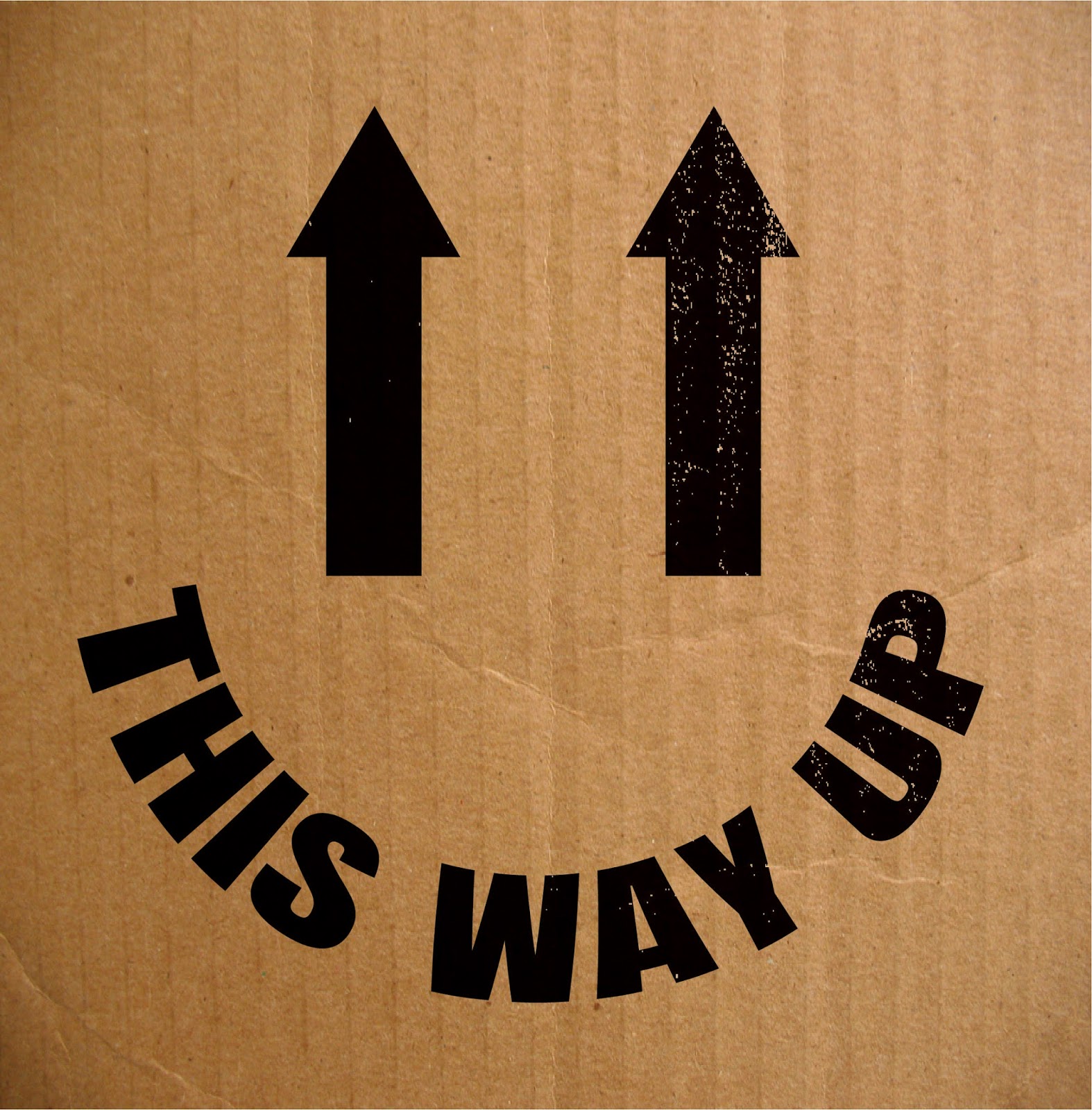


This Way Up:
I thought that this idea is quite funny, I want to mock it up on a cardboard box so that it looks more realistic.


I think that the second one works better being on a darker box, also the fading oout of the black makes it look like it is actually on the box.


I also think that it provides a nice strong contrast with yellow type on a black background to emphasise the smiley face.

Wednesday, April 18, 2018

OUGD603 Brief 07: The Clash - I'm Not Down (Development)

The Clash - I'm Not Down (Development):

Based on the ideas that I had sketched down I took a few of them to start developing them digitally. I have experimented with colours which are used within punk design, high contrast and colours that clash.

I started working with the spiral idea.


I added a brush effect to the spiral lines and it has created a really nice effect and the colour contrast works well to stand out.


I was thinking about the arrows on boxes that say 'This Way Up' and I thought about how I could ironically change this into a smiling face.


I began looking at how I could play around with upwards arrows and pattern.


I began thinking about one of the lyrics talking about skyscrapers, so I thought id do the perspective as if down on the ground looking up at how tall they are.


I thought about those inflatable punching bags that obviously get knocked down but come back up. I then thought about making the punching bag a clown because a clown always has a painted on smile and they aren't down.