Exploration of banknotes design:
The first banknote appeared in China in about 618AD, they named this practice fei-chien or “flying money.” The oldest surviving paper notes were issued during the rule of the Ming Dynasty, between 1368 and 1399. The Ming dynasty’s 200 Kwan note is nearly the size of a legal document. The note was manufactured from recycled gray mulberry bark paper.
Even the designers of this banknote designed it to be coherent and accessible to as many people as possible. This Kwan note shows two strings each holding 10 coins, so that even people who could not read would understand the banknote. The pictures as well as the written denomination code and legal description are surrounded by complex patterns, dragons and clouds, which both enhance visual appeal and protect against forgery. By clearly supporting key content with the graphics, the ancient Chinese currency notes remained accessible yet appealing to the eye.
This is something that I need to remember when designing my banknote, the content needs to be easy to understand and interact with all people.
In the 1860's the dollar became the sole currency for the US during the civil war. The first US dollar resembled a formal certificate and featured a portrait of Salmon P. Chase. The dollar was printed in green because that represented stability and growth. This has however been criticised as green and black is hard to view for the visually impaired.
The US Educational Series banknotes (1896) was the subject of controversy due to the classical female figure depicted on it. (Shown below)
Intaglio printing is among the features that have given US currency its distinctive appearance over the years.
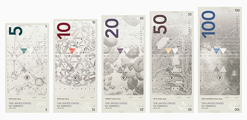
The dollar has only really undergone subtle changes with no major redesigns. In 2009 Richard Smith started the Dollar ReDe$ign Project. Anyone could submit, it was done to help stimulate the US economy.
Examples:
These are two really interesting responses to the dollar that are completely different from the original design. After looking into the US dollar I feel that redesigning can be potentially harder than designing from scratch
Banknote designs:
Norway
Snøhetta’s concept is inspired by the impact Norway’s extensive coastline has had on the country’s identity, heritage and industry. Digital meeting analog, and pixel on paper becomes a metaphor for the long boundary between land and sea. Pixellated mosaics informed by different coastal details such as fishing boats and oil rigs divide the denominations. I particularly like this design because compositionally it is laid out in an accessible way that is pleasing to the eye. The use of colour within the design provides and interesting visual appeal that draws you into the beauty of the note.
Hong Kong Special Administrative Region 10 Dollar note
Captures and reflects the spirit of the city: future-facing, vibrant and intense. I particularly like the geometric feel it has which provides a captivating design.
Seeing these examples has made me realise that I can take my design anywhere that I wish. But a reflection of where the banknote is from is evident within all the designs I have looked at. The key things I want to reflect through my design is accessibility and heritage.


No comments:
Post a Comment