Final Outcome:
Kathryn arranged for one of her friends from photography to take pictures of the game for us.
Advert:
The advert uses a catchy jingle to keep the pace of the video. It mainly compromises of text with imagery of the cards. It explains the gameplay in a clear engaging way through different effects and use of colour.
Play-through:
The video shows clearly how the game is played whilst the use of text helps to give a greater overall understanding.
Submission:
D&AD required one video acting as an advert for the game and another video on how to play the game. We booked out a photography studio so that we could film some gameplay in action. Courtney edited both videos as she has the most experience working in after effects.
We also had to put 2 submission boards together about the research and development of the game.
Feedback for video:
- Relates to packaging
- Works well as it explains association
- End with the A’s rather than drop them
- Music is ‘perky’ functional and keeps the pacing quick which relates to the game
- Larger text and highlighting text works really well
- All the different colours work better pop out on the shelf
- Finish on pattern
- Change packaging to colours on final frame of video - vibrant colours
Feedback for R&D boards:
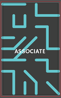
- Associate looks like title of the board not the game
- Have a heading to show that these are the original games
- Instead of decision could be a question that we are responding to
- Key paragraph of snap - what we have taken from it concise points - what elements have we taken forward?
- Have same tone of voice as the video - the simplicity could be transferred over - could be designed - edit it down less wordy - element of fun
Printing:
Packaging:
We decided to print the packaging on a clear sticker and on matte to see which worked better. The clear sticker allowed for the box to come through where there were white bits on the design. The matte sticker had brighter colours which did stand out more but we all felt that the clear sticker worked well with the box.
The design was quite fiddly to apply and unfortunately there are some air bubbles. We also decided that the design would pop more on a white background, so we added a white insert to the inside of the box.
Cards:
The cards printed out really well double sided on a thick matte stock. Courtney cut down the cards for us.
Packaging Design:
Now that I have a pattern to work with for the packaging it will mainly be about layout and organisation of type.
Title Typeface:
I tested different typefaces for the main title that would go on the box. We decided that Heavitas would be the most appropriate due to its big bold letterforms. The rounded edges help to set a friendly tone.
Supporting type:
We decided to choose Muli for the supporting type as it has a nice consistent thin weight which helps give a clean look. The rounded forms also help to give it a friendly tone.
Icons:
Based on the research I had done, icons are a quick and easy way to display key information. We decided that the circle shape better suited the overall design keeping the friendly open tone. I used Arial Black for the typeface as it's clear and legible.
Design:
As we are printing the design using stickers to cover the packaging, a clear sticker could work well with the frosted box. The A's could be a block colour working with the box. I tried out having a block colour on the bottom half of the box but I don't think that it works very well.
I think that having the pattern all over will produce a more cohesive design. I then began to think about placement of the icons and the text.
Because the pattern is quite busy the text needs to be contained in a box to stand out. I started to play around with different alignments/placements and found that centrally aligned looks the best as the eye is drawn straight in. The icons have been coloured to fit in with the rest of the design.
Emma has come up with a different pattern design so I have tested that out so we could compare and see which one works better.
We decided that Emma's new pattern worked better as it stands out and draws more attention.
Final Net:
The net had to be put together so that the pattern followed on appropriately when it's cut into the different sections. The design was done on illustrator, 1 layer for the design the 2nd for the cut out.
Packaging Net:
The box arrived so I measured all of the sides so that I could created a net from it.
Rules:
We knew that the wording of the rules was really important as this determines whether the game is easily understood and how quickly it can be learnt. Based on the rough rules we had already wrote, we typed up a clearer version working on the wording.
1.
2.
Kathryn then started working on the layout and design for the rule sheet. We decided to use Muli as the typeface as it is clear and friendly.
Card Design Development:
We decided to work further on the back of the cards as we weren't completely happy with the outcome.
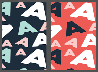
Emma came up with a new design variation working with the A's but using a different typeface, placement and colours.
We decided the bottom two variations were the most appropriate, the blue for the main deck and the red for the penalty cards. This design change came very last minute before our print slot, but everyone in the team was happy to go forward with it.
Card Design:
Using the colour palette we applied that to the cards, we didn't want the whole card to be all one colour as we felt breaking it up with white would look more clean.
Typeface:
We chose HammersmithOne regular as the type that we would be using on the cards. We felt that it is a fun and friendly typeface with it's rounded letterforms and slight flicks at the end of the letters. It is also highly legible making it appropriate for the cards so that it can be read with ease.
Originally we had the type centrally aligned at the top and bottom of the card but that left a lot of unnecessary space. We decided centrally aligning the type in each half would make it easier to read.
Illustrations:
Kathryn volunteered to do the vector illustrations as she had previously done a project which had improved her skills on illustrator. We decided only one person should do these as we needed the style to be consistent. The illustrations use the colour palette we selected and are done in a friendly open style, to remain as gender neutral as possible. Keeping the illustrations within a circle helps the design remain consistent across the cards.
Penalty Cards:
We wanted to keep the penalty cards as simple as possible, the type is central but with a left alignment so that it is easy to read. A thin red border helps to break up the white space and exaggerate the fact that its a penalty.
Back of Card Pattern:
Courtney worked on the pattern for the back of the cards, this design would inform the rest of the design style for the packaging. She did lot's of different variations working with different styles.
Using old colour scheme:
Looking through Courtney's designs the split colour were our favourite but there was something just missing from the design.
After seeing a tissue with a typographic pattern I suggested that was something we could do with the A's.
Courtney then made a pattern out of the A's.
We knew that the double sided printer in uni is slightly off, by using a repeat pattern it won't need to line up.
The blue colour will be for the main cards but the penalty cards will be in red.
We all felt that this design was better suited to the overall design of the game, as it has a fun, playful placement.


