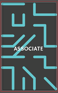
Using the colour palette we applied that to the cards, we didn't want the whole card to be all one colour as we felt breaking it up with white would look more clean.
Typeface:
We chose HammersmithOne regular as the type that we would be using on the cards. We felt that it is a fun and friendly typeface with it's rounded letterforms and slight flicks at the end of the letters. It is also highly legible making it appropriate for the cards so that it can be read with ease.
Originally we had the type centrally aligned at the top and bottom of the card but that left a lot of unnecessary space. We decided centrally aligning the type in each half would make it easier to read.
Illustrations:
Kathryn volunteered to do the vector illustrations as she had previously done a project which had improved her skills on illustrator. We decided only one person should do these as we needed the style to be consistent. The illustrations use the colour palette we selected and are done in a friendly open style, to remain as gender neutral as possible. Keeping the illustrations within a circle helps the design remain consistent across the cards.
Penalty Cards:
We wanted to keep the penalty cards as simple as possible, the type is central but with a left alignment so that it is easy to read. A thin red border helps to break up the white space and exaggerate the fact that its a penalty.
Back of Card Pattern:
Courtney worked on the pattern for the back of the cards, this design would inform the rest of the design style for the packaging. She did lot's of different variations working with different styles.
Using old colour scheme:
Looking through Courtney's designs the split colour were our favourite but there was something just missing from the design.
After seeing a tissue with a typographic pattern I suggested that was something we could do with the A's.
Courtney then made a pattern out of the A's.
We knew that the double sided printer in uni is slightly off, by using a repeat pattern it won't need to line up.
The blue colour will be for the main cards but the penalty cards will be in red.
We all felt that this design was better suited to the overall design of the game, as it has a fun, playful placement.


No comments:
Post a Comment