The brief is to tell a lie convincingly and produce things to help aid the lie.
- Can't tell other groups
- Can't involve others
We will be presenting our lies on Friday in front of some professionals who will decide whose lie is the most convincing.
Team Members:
- Josh
- Lallie
- Hannah
- Aneta
Initial ideas:
- Takeshi's Castle
- Raven
- Secret greggs menu
Our Idea:
- Fresher audience event
- Event opening in Trinity Kitchen
- Levi Roots Caribbean Smokehouse
- Flyers, posters, voucher/food token, mockups
- Take inspiration from the online menu
Tonight (Monday) - main research
Tuesday - start designing
My Research:
Menu:
The menu compromises of three main colours, teal, yellow and orange, this is something we will probably want to keep the same so that the branding of the event looks legitimate. There is also a handcrafted element which comes through the heading typeface, being a hand-drawn script style, as well as the illustrations. I think that choosing a similar style typeface will also be beneficial to keep the illusion of the brand.
Colour Scheme:
f05548
f9d95e
82caaa
Typeface Ideas:
Google Fonts - Pacifico
This typeface is a similar one used on the branding of the menu, it's also fun and playful, suiting a young audience.
Google Fonts - Luckiest Guy
Google Fonts - Leckerli One
Google Fonts - Londrina Solid
Google Fonts - Barrio
Important quote:
This quote seems to be integral to the brand and to add that levi roots personalisation, we could potentially use this. It also includes his signature which could further emphasise that it is his event.
My poster designs:
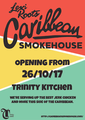
The first design was found to be the most appropriate and eye-catching, as well as fitting well with the rest of the teams design.
This was a good task to bring my back into design as I felt very out of practice over summer.


No comments:
Post a Comment