Feedback:
Today we received feedback on our narrative and overall art direction for our animation. This feedback was extremely positive regarding the general design for the scene and the mink. The illustrative style is friendly and approachable and will appeal to a younger audience which people agreed is better to target, as adult perceptions are harder to change. Someone also suggested making the mink into a character by giving it a name, that way people will make a more personal connection which creates more empathy for the cause.
We also asked how we could improve on the share-ability through social media and it was suggested to make gifs from the animation which help to get the more hard hitting facts out there. Moving beyond an animation there was also talk about printing the mink scene onto a t-shirt or tote bag, this way it would help to communicate more to the fashion market, hopefully getting the message across.
Regarding Scene C it was suggested that we needed to somehow illustrate more clearly that it takes 60 minks to make one fur coat rather than just saying it. Such as placing more minks in the scene to better communicate and have more of an impact with the viewer.
Overall this feedback was useful for us to know that we are heading in the right direction and to make sure that we were getting the design right as it could be quite a sensitive topic.
Thursday, March 9, 2017
Monday, March 6, 2017
OUGD503 Studio Brief 02 - Fur For Animals - 6th March
6th March - Idea Development
We met again together as a group to discuss through the storyline of our animation. Ed came up with the basis for our storyline to work from. This made the process a lot easier to visualise and work with as we could really develop and fine tune the idea. Together we discussed and worked through the different scenes that we would need. This allowed lot's of ideas to be thrown around to make sure we could make the best out of it.
Typed up scene run-through:

Typed up text content:

This narrative aims to help make the viewer understand the reality of the fur trade as well as creating empathy. We wanted to keep it as clear and concise as possible to translate it clearly for different target audiences.
Too make sure that we weren't visualising it all in different ways I thought that it was best for us to draw a rough storyboard, that way everyone is clear in the direction we were taking. We did rough sketches to help communicate the idea and make sure that everyone understood.

We also came to the conclusion that instead of doing stop-motion photography we would scan in each element and animate it individually. The stop motion would be hard to set up and keep a constant lighting, it also probably wouldn't be very professional as it something we all haven't really done before.
Kieran's illustrative style produced a design which has a strong colour focus and is extremely approachable, making it suitable for a wider audience. I am really pleased with the outcome that he has produced as the design is friendly, it won't shock or scare the viewer, making it more shareable.

As Kieran comes up with more scene designs, me and ed are working out how best to animate it.
OUGD503 Studio Brief 02 - Fur For Animals - Research (Campaigns)
Research (Campaigns):
Endangered Emoji by WWF

- Supporters signed up to pay a small donation every time they tweeted one of the 17 endangered animal emojis.
- Light hearted
- Engage with a younger audience
- At the end of the month the individuals total would be calculated and then could be donated voluntarily.
Flaw in the Law by NSPCC

(https://vimeo.com/119652924) - Video link
- Prompted UK law to be changed, to make it a criminal offence for an adult to send a sexual message to a child.
- A petition shared on social media
- Created conversation
- Highlighted some of the UK's bizarre and ridiculous laws, which made the lack of law protecting children seem even more outrageous.
- Soft style makes it more watchable.
National Trust Challenge

- Instagram
- Asked their followers to upload photos of National Trust protected buildings, landscapes and coastlines, choosing a winning photo every week.
- Instagram following is now over 50,000, proving that the #NTChallenge was a fantastic way to both celebrate their existing community while also attracting new National Trust supporters.
- Simple, easy
WWF - Tiger VR Experience

- The public step into the boots of a ranger and come face to face with a tiger
- Through its virtual reality fundraising and awareness campaign, which took place in shopping centres in London.
- All ages
- High interaction
- More personal experience
Looking into different successful digital campaigns makes it clear that it is all about the high interaction and user experience. I have also noticed that a light hearted nature, where it doesn't try to shock or guilt the viewer works best. This is something we need to take into consideration when coming up with our own ideas.
Endangered Emoji by WWF

- Supporters signed up to pay a small donation every time they tweeted one of the 17 endangered animal emojis.
- Light hearted
- Engage with a younger audience
- At the end of the month the individuals total would be calculated and then could be donated voluntarily.
Flaw in the Law by NSPCC

(https://vimeo.com/119652924) - Video link
- Prompted UK law to be changed, to make it a criminal offence for an adult to send a sexual message to a child.
- A petition shared on social media
- Created conversation
- Highlighted some of the UK's bizarre and ridiculous laws, which made the lack of law protecting children seem even more outrageous.
- Soft style makes it more watchable.
National Trust Challenge

- Asked their followers to upload photos of National Trust protected buildings, landscapes and coastlines, choosing a winning photo every week.
- Instagram following is now over 50,000, proving that the #NTChallenge was a fantastic way to both celebrate their existing community while also attracting new National Trust supporters.
- Simple, easy
WWF - Tiger VR Experience

- The public step into the boots of a ranger and come face to face with a tiger
- Through its virtual reality fundraising and awareness campaign, which took place in shopping centres in London.
- All ages
- High interaction
- More personal experience
Looking into different successful digital campaigns makes it clear that it is all about the high interaction and user experience. I have also noticed that a light hearted nature, where it doesn't try to shock or guilt the viewer works best. This is something we need to take into consideration when coming up with our own ideas.
OUGD505 Studio Brief 02 - Identifying an area of interest
Identifying an area of interest:
Post Brexit Racism

Racist or religious abuse incidents recorded by police in England and Wales jumped 41% in the month after the UK voted to quit the EU. Strong anecdotal evidence supports the view that there was also a genuine rise in crimes targeted at ethnic minorities and foreign nationals: the Brexit vote appeared to unleash something in people - they felt they had a licence to attack Polish migrants and insult Muslims.
This is something that I personally find really shocking and sad, that racism is still happening in this day and age. I think I could be really involved with this issue and really strive to produce something really effective.
http://www.bbc.co.uk/news/uk-politics-37640982
Groups of interest:
- Migrant's Rights Network
- HOPE not hate
Homelessness in the UK

All forms of homelessness have risen due to the shortage of housing and ongoing effects of the economic recession combined with government policies - particularly reforms and cuts to housing benefit. Homelessness is an isolating and frightening experience. Homeless people are invisible, ignored and forgotten. At worst, homelessness can mean sleeping rough on the streets. However the problem of homelessness is much bigger than that of rough sleeping.
http://www.crisis.org.uk/pages/homeless-def-numbers.html
Charities:
- Crisis
- Shelter
- Emmaus
- Barnados
- The Salvation Army
Britains Mental Health Problem

1 in 4 people in the UK will experience a mental health problem each year. The overall number of people with mental health problems has not changed significantly in recent years, but worries about things like money, jobs and benefits can make it harder for people to cope.
"Despite it affecting so many of us, prejudice against people with a mental illness still exists, and there is some resistance to the provision of community care for people suffering with mental ill health".

Charities:
- Mind
- SANE
- Mental Health Foundation
After looking into three areas of interest I want to try and tackle the issue of hate crime and racism within the UK. I think that this is a really important issue, there aren't any positives that come from racism and it is something that still needs to be addressed. I am going to do further in depth-research so that I can come up with varied responses.
OUGD505 Studio Brief 02 - Design relating to social, political or ethical change (Presentation Practice)
Design relating to social, political or ethical change (Presentation Practice):
The task is to identify a piece of design that relates to social, political or ethical design. I have identified two pieces of design that hopes to have a social impact within society. To help build confidence for PPP presentations, we had to deliver a short presentation.
Skittles gives up its rainbow for Pride


- To celebrate gay pride.
- Design / idea from adam&eveDDB (communications agency - company made up of people from advertising, design, digital, technical, social media and direct.)
- 2016
- Open letter addressed to Pride in London:
“So this is kinda awkward, but we’re just gonna go ahead and address the rainbow-coloured elephant in the room. You have the rainbow … we have the rainbow … and usually that’s just hunky-dory. But this Pride, only one rainbow deserves to be the centre of attention – yours. And we’re not going to be the ones to steal your rainbow thunder, no siree. That’s why this weekend, we’re giving up our rainbow. But don’t worry, we’ll still be there to celebrate every colourful minute with you, we’ll just be completely starkers while we do it. Have a great day, Pride. From Skittles.”
- A colourless Skittles float joined the parade, they gave out monochrome packets of their sweets, ads displayed, social media campaign with #onerainbow
- Humorous tone, keeps the message light and has better engagement.
- Sparks conversation
- The organisation of type helps to add visual appeal and works cohesively with the content to make sure the message is clearly communicated.
- Minimal design helps to clearly communicate message - the stark contrast to their normal design provides a high impact design.
- Downfall is Skittles are effectively using the occasion to drive sales, but because the message is strong it does help to raise awareness and bring recognition.
https://www.creativereview.co.uk/skittles-gives-up-its-rainbow-for-pride/
Signs for the homeless - Kenji Nakayama and Christopher Hope
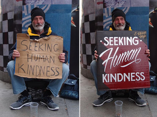
- Started in 2011
- Raise awareness about poverty and homelessness around the Boston area.
- “A sign in exchange for donations and a hand painted sign.”
- Document with a before and after photo of these people they swap signs along with a brief interview offering some insight into the individuals circumstances.
- Signs are bright and colourful to attract attention to their needs. They feature all the same text as their old piece including any misspellings and grammatical errors.
- The goal is to aid these people by giving them attention when they are usually overlooked, to an extent humanising them.
- Creates a connection with people.
- "It’s important, but when it comes to helping homeless people, it’s just a sign—now it’s more about the story about the people that is what matters," said Nakayama. Makes people want to find out more, so project has another layer.
- The sign becomes a talking point about the real issue at hand and where change can happen.
- "my hand-painted signs are kind of like bringing a story to the public about the people I exchange the signs with,” said Nakayama.
- Project has drawn criticism, including exploitation of the homeless and the fact that people may not believe they are homeless and not take their situation seriously with a 'flashy' sign.
- Nakayama, who works full-time at the Boston-based Best Dressed Signs, where he does hand-painted logos for local businesses, has received artwork and offers from the U.S. and abroad, all wanting to be a part of the project.
- The sign is a starting point, it's to get people thinking about what more can be done to help the homeless.
http://mymodernmet.com/kenji-nakayama-christopher-hope-signs-for-the-homeless/
This helped me start get thinking about what can be done to tackle different issues, and how creative different responses can be. The first thing that I need to do is to identify a problem, something that I can get into and show a deep interest in.
OUGD505 Studio Brief 02 - Product, Range and Distribution
Brief:
Examine graphic design outputs relating to social, political and ethical change. Aim to increase my awareness of historical examples plus contemporary practice that is responsive to 21st Century issues. Note the interrelationships between medium, message and distribution.
I should then produce a body of research work that explores the connections between these concepts and their respective design outcomes prior to my own practical and conceptual exploration of possible products, ranges and methods of distribution that may be suggested by my preferred content or, indeed, those that reflect my own ideologies, concerns and/or ambitions.
Background / Considerations:
Part 1:
Based on the introductory sessions develop a practical, visual and contextual investigation of a specific subject. I should aim to develop research from a range of primary and secondary sources in order to fully explore the opportunities for informed creative development. My research and development of this part of the brief should be documented on my Studio Practice blog and will be presented as part of my interim concept pitch.
Part 2:
Devise and develop a body of practical work that both distils my knowledge of an identified issue and demonstrates my ability to tap into the market potential for socially, politically and ethically-driven design. This output should still work within the broader creative and professional contexts of graphic design but could be based around ideas of awareness or protest.
Examples of potential deliverables include (but are not limited to):
- materials relating to an issue-led campaign (this could be one affiliated to an established organisation or a more ‘guerilla’ approach)
- a poster series
- a booklet/publication/manifesto
- a web/digital platform
- placards, banners or a set of badges
- a range of products or merchandise that communicate your identified core message
My contextual research, critical observations and reflective evaluations should be documented on your Studio Practice blog and summarised within reflective content that supports my design submission. My response should explore the relationship between product range and methods/media of distribution as well as specific audiences, contexts and appropriate tone of voice.
Mandatory Requirements:
As defined by your interpretation of the selected brief.
I will need to meet any mandatory requirements specified on individual briefs.
In addition to the submission requirements for the briefs I will need to evidence the research, development and production of your resolutions.
My work should be documented through regular labelled posts to your Design Practice Blog.
Correct labelling of your work on your blog is essential. Failure to organise my work clearly will affect the assessment of your work.
My response to the brief should be supported by a rationale and evaluation of my work in relation to the initial brief.
Deliverables:
Resolutions & Products appropriate to my selected brief(s).
A minimum of 5 x A3 design boards/design sheets (submitted as PDFs) articulating the selected research development, resolution and contextualisation of my work.
Posts to my Design Practice blog demonstrating my ability to effectively record, document and critically evaluate the progress of my work in relation to my own intentions and appropriate areas of contemporary creative practice.
Sunday, March 5, 2017
OUGD505 Appropriation & Subversion
Appropriation
Appropriation - the deliberate reworking of images to produce a different meaning.
Marcel Duchamp - 'Fountain' (1917)

'Andy Warhol, 'Marilyn Monroe', 1964' by Richard Pettibone (1968)

David La Chappelle - 'Amanda as Warhols Marilyn' (2002)
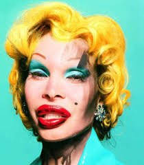
- Using images from mass culture and changing them
- Questioning what fine artists were doing
- Examining and highlighting
- Legal issues of plagiarisms (Warhols Marilyn)
Appropriation in fine art:
- To question authorship and authenticity
- To question what art is or can be
- To investigate process and making
- To question the value and meaning of mass culture
Cultural Appropriation:
- How societies use distinct symbols, culture, religion and use it in a different way.
- Parody
- Pastiche

Sanaa Hamid. 2013

My Appropriation Collage:
Task - Appropriate images to relate to social, political or ethical themes.

Within my collage I aimed to use big typography to create a discussion point of Donald Trump and what is happening in the world. The use of images suggests the ways in which society views things, through the media, surveillance, protests etc. I wanted to capture the madness and disarray. I decided to also doodle on top of one of the images as I really wanted to emphasise my view on Trump.
We all went around the room looking at each others work which addressed a variation of different issues. We then had different categories in which we were to score each other out of 10.

Overall I think that the message of my collage was received and understood relatively well. It has given me a better understanding of how I can create another meaning through image and text. I also really enjoyed working in this collage style, the practical approach is more hands on, so I found it an engaging activity.
Subscribe to:
Posts (Atom)