For this years Leeds Indie Food festival the branding is bright, bold and cheerful. The simple graphics are fun and eye-catching, appealing to a wide audience. This years colours are pink and blue with a dark purple outline. I think that I want to incorporate these colours into my design as this will help to show the cohesion with the festival. This simplistic graphic style is something I may also want to consider within my design.
Ideas:
- Simple
- Bold
- Striking graphic
- Independent businesses
- Food passport
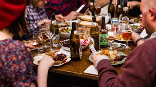
- Gathering people together
- Celebration
Photos:


No comments:
Post a Comment