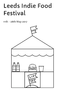
I started looking back through old photographs of the festival and I noticed there were lots of little food stalls and tents, this seemed to be one of the main features of the festival, predominantly at the Leeds Feast. The tents are small independent businesses, which is at the heart of what this festival is about. I decided to use this to create my own simple food tent, working in the cartoon graphic style that is associated with the branding.
On illustrator I created the simple outlines to represent a food tent/stall. I want this to have the main focus on the poster remaining quite central. I used the logo on the tent so that there branding works cohesively.
I started thinking that I wanted to incorporate type, but keeping it to a minimal, having nothing more than the name of the festival and the date. I tried a range of typefaces to ensure that it would fit appropriately.
Capriola:
Asimov:
Geneva:
Lucida Grande:
Gill Sans:
Sinhala Sangman MN:
Avenir Black:
The typefaces that I have selected are all sans serif as this seemed most appropriate to match with the graphic illustration. After receiving some feedback from my peers, it was felt that Avenir Black would be the most appropriate due to the line weight being bold and standing out, creating a variation from the illustration. The corners of the type match with those in the illustration, to provide cohesion between text and image.
I then began thinking about how I could apply colour to the print in a more interesting way then just having the lines coloured. It was suggested to inverse the design so that the background would print with colour and the lines would be clear, showing the paper underneath.
I want it to fit in with the festivals colours to make it recognisable, this consists of two colours, blue and pink. To try and incorporate both, I am going to look into split fountain screen printing.


No comments:
Post a Comment