Monday, November 13, 2017

OUGD603 Brief 02: Final Design & Submission

Final Design:
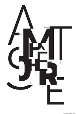
I edited the scanned in image in photoshop to provide a higher quality and more vivid design.


The ambiguity of the letterforms help to highlight the beauty of the shapes, while the golden ratio creates harmony in which the type can take on a new form. This form functions as one whole, creating an intriguing and exciting design.

Submission:


The deadline has been extended to the 15th of November which means that the declaration of results is later, it's now the 30th of December.

Overall I have really enjoyed doing this brief, the short time scale allowed me to come up with ideas quickly. I also enjoyed taking a more hands on approach to the design process rather than working solely digital. Typography is something that I haven't really experimented with much in the past, and it was fun to use it in a more abstract way to produce an engaging and interesting design.

OUGD603 Brief 02: Design

Design:

I began by experimenting with different patterns using the golden ratio.


Im going to work further with the 1st and 3rd pattern as I think these produce the most pleasing shapes. 

I decided to use the words Beauty, Form and Function. I want the letterforms to be at various sizes to create an abstract image and to be able to fit within the areas.

Futura - geometric, even.


Helvetica - dense, compact, neutral.


I cut out all the type and arranged it within the pattern. I then glued them down in variating position where only some of the letterform is visible making it more of an ambiguous design.

Futura, pattern 1:


I then scanned in the best designs to work with them digitally, smoothing out the lines.

Helvetica pattern 1:


Futura pattern 2:


To decide which design I wanted to submit I printed them out, I decided to do this on yellow stock to reflect the 'golden' ratio. I also inverted the colours of the design to produce different striking effects.


I showed the different variations to some people within my class, after discussing through which one worked the best it was felt that the last design should be submitted. This is due to it having a more complex design that creates intrigue, the ambiguous letter-forms appear within the spaces in interesting ways. The bolder letterforms also create a contrast, standing out in comparison to the lines of the pattern. Having the fill as black with the yellow coming through provides a high contrast which makes it stand out. 

I wanted to keep the colour the same as on the paper so I decided to scan the design back in.


OUGD603 Brief 02: Initial Ideas

Initial Ideas:
To begin thinking about ideas quickly, I created a mind-map to help me.

I began by thinking about geometric shapes and how they reflect beauty form and function.


I then thought about how I could cut up letterforms and collage them into shapes.


I then began thinking more about the golden ratio and how that represents pleasing and natural forms, and I thought that it would represent beauty, form and function perfectly. I still liked this geometric pattern so I experimented with how I could create this using the golden ratio.


OUGD603 Brief 02: Research (Type Poster Designs)

Research (Type Poster Designs):

I think that it will be beneficial to look typography posters to see the different styles and approaches that are used.


I like the collage style and the layering of the type at different scales to produce a really interesting form.


I like the way that the letterforms are used to make a pattern and the reflection helps to increase the intensity of the design.


I like the way that most of these posters manipulate the type to create a new engaging form. Looking at these posters helps to highlight the possibilities of what can be done with typography.

OUGD603 Brief 02: Research (Typefaces)

Research:

Massimo Vignelli:

Massimo Vignelli was an Italian designer who worked in a number of areas ranging from package design through house-ware design and furniture design to public signage and showroom design.

Vignelli is famous for sticking to a handful of typefaces preferring only six.


“timeless, legible, and elegant” 

Vignelli stated that “type is important…but structure should always come first.”

'He expounds on his philosophy in Canon:

As I said, at the time, if all people doing desktop publishing were doctors we would all be dead! Typefaces experienced an incredible explosion. The computer allowed anybody to design new typefaces and that became one of the biggest visual pollution of all times. …


I still believe that most typefaces are designed for commercial reasons, just to make money or for identity purposes. In reality the number of good typefaces is rather limited and most of the new ones are elaborations on pre-existing faces. Personally, I can get along well with a half a dozen, to which I can add another half a dozen, but probably no more. Besides those already mentioned, I can add Optima, Futura, Univers (the most advanced design of the century since it comes in 59 variations of the same face), Caslon, Baskerville, and a few other modern cuts. As you can see my list is pretty basic but the great advantage is that it can assure better results. It is also true that in recent years the work of some talented type designers has produced some remarkable results to offset the lack of purpose and quality of most of the other typefaces.'


(https://fontsinuse.com/uses/14164/massimo-vignelli-s-a-few-basic-typefaces)

Helvetica:


- Developed in 1957 by Max Miedinger with Eduard Hoffmann at the Haas'sche Schriftgiesserei (Haas Type Foundry) of Münchenstein, Switzerland.

- Sans-serif typeface that could compete with the successful Akzidenz Grotesk in the Swiss market.

- The aim of the new design was to create a neutral typeface that had great clarity, no intrinsic meaning in its form, and could be used on a wide variety of signage.

- Neutraility - no meaning - based on the idea that type itself should give no meaning.

- Simple

- Wide spread use

- Associated with corporate culture and business to some degree

- Adaptable

- Legible

Technical Details:
- Helvetica’s characters always have vertical or horizontal terminations on their strokes, never diagonal.
- Helvetica is as much about the negative space surrounding the letters than about the lines that make up the characters themselves.
- The negative space contained within the lowercase “a” closely resembles a teardrop.
- It has monotone stroke weights.
- It remains legible when in motion, one reason it’s popular for signage and automaker and airline logos.

Futura:


- Futura is a geometric sans-serif typeface designed by Paul Renner and released in 1927.

- It is based on geometric shapes, especially the circle, similar in spirit to the Bauhaus design style of the period.

- It was developed as a typeface by the Bauer Type Foundry, in competition with Ludwig & Mayer's seminal Erbar typeface of 1926.

- An appearance of efficiency and forwardness.

- "the typeface of today and tomorrow"

-  combination of classicism and modernity

- Popular

- Versatile

- Modern, clean, elegance

Technical Details:
- It is based on strokes of near-even weight, which are low in contrast.
- The lowercase has tall ascenders, which rise above the cap line, and uses nearly-circular, single-storey forms for the "a" and "g", the former previously more common in handwriting than in printed text.

I want to work with both typefaces as both are seen as legible and functional for a range of uses. I think it would be interesting to see if I could help to make these typefaces reflect the beauty in simplicity. 

OUGD603 Brief 02: Typography Day 2018 Poster Design Competition

Typography Day 2018 Poster Design Competition:

‘Beauty, Form and Function in Typography’

Design a poster To Express Beauty, Form and Function in Typography. 

You can use 
- The Language, Script and Typeface of your choice. You can make use of one letter, one word, many words or even a paragraph composed of words.
- Calligraphic or digitally created letterforms or existing fonts, or a combination of these can be used for the poster.

The resulting poster should be of the size and specification given below. 
This competition is open to students, faculty and professionals. The competition is open to all - non resident Indians, as well as foreign citizens can take part in it.

Selection procedure for winners:
Twenty five winning entries will be published as a book and displayed in an exhibition during the event. The winners are entitled to free participation (workshop expenses and food) during the ‘Typography Seminar and Workshop’ on 1st, 2nd and 3rd of March 2018.

Each of the winning participants will receive 2 copies of the book and will also be given the 'Certificate of Winning the Poster Competition'. 

Submission Specifications:
You need to submit the solution along with a brief write-up of around 150 words.

Poster:
Size of the final poster:420mm x 600mm only in portrait format
Resolution: 300 dpi
File type: JPEG or PDF
Color Mode: CMYK

Write-up + contact Info+Bio:
Format: in RTF, TXT or PDF format
Write up about the design: Maximum 150 words and should be written in English
Contact Info: Name, Postal Address, Email, Telephone number, Name and Address of Institution in English.
Your Bio-data/Personal Information: Maximum of 100 words and should be written in English.

Deadline for Submission: 31st October 2017

Declaration of Results: 30th November 2017


Each participant is allowed a maximum of three entries.

This brief could be done within a short time scale, making me work quickly and effectively. It will also help me to work and experiment with typography so that I am more confident at using it.

Time Plan:
I want to keep this to a quick, short deadline so that I come up with ideas and get something produced fast. Im going to spend 1 week from the 23rd - 31st of October.

Tuesday, October 10, 2017

OUGD603 Brief 01: Final Designs

Final Designs:

Poster:


Our poster design uses icons to represent the creative speaker, these can be easily changed for each creative network event. The bright pops of colour hope to catch attention and draw the eye in. Overall it is quite an ambitious design as it is completely different from previous years.

Flyers:


FRONT - we decided to use the icons as a background pattern and again using the LAU logo shape to connect with the university. We produced the flyer in two colour variations.

BACK - we kept the design simple but still reflecting the main poster.

Moving Image:
As Courtney is the most experienced using after effects, she created a short moving image.

Outcome:
Unfortunately we didn't win the brief but I still enjoyed working together with people on a project. We were able to combine our design skills to produce something very different from what I would usually do. It was also good working to such a short time scale as we had to produce ideas/designs quickly. 

Sunday, October 8, 2017

OUGD603 Brief 01: Digital Developments

Digital Developments:
We met again briefly to decide on a typeface that we were going to use and the overall design of the poster, combining our different styles together. We decided to use icons which represent Ileen in some way.

Heading Typeface: 
Heavitas - We chose this as it was big, bold and engaging it commanded attention immediately.

Copy Typeface:
Futura Medium - We chose this because it is a neutral typeface to contrast with the header, something that is open and legible.

My Digital Design:


Group Poster Developments:


Initial poster layout design from Emma, colours taken from Ileen's website.


Toning down the vibrancy of the turquoise and applying the icon design.


We decided that the cubes weren't very relevant and it would be more appropriate to use the LAU's shape.


We added in the text and appropriate logo's but we still felt that it looked awkward and didn't quite flow with the design.


We decided to change the whole design as we were still unhappy with the result. We inverted the icon design to be in the middle shape and stripped back the colour, having bright pops to create interest. After asking for some feedback it was suggested to apply the hexagon shape behind the text to make the title stand out more. Information is also laid out more clearly and is easier to read.


Wednesday, October 4, 2017

OUGD603 Brief 01: Research

Research:

Previous Designs:


- Image focused
- Some of the older designs lack excitement, don't really grab attention
- Information at a relatively small scale
- Simple

Ileen Gallagher:


Ileen Sheppard Gallagher (ISG) produces memorable experiences and destinations that inspire and inform. Projects range from new museums, corporate attractions, and citywide film/media celebrations to exhibitions, special events, the organization of archives, and beyond.


Clients include:
- Harley Davidson
- Rock and Roll Hall of Fame and Museum
- Elvis Presley Enterprises
- The Walt Disney Family Foundation

Poster Inspiration:
We created a shared pinterest board acting as visual inspiration for techniques and layout.