What is a zine?
A noncommercial often homemade or online publication, like a magazine, usually devoted to specialised and often unconventional subject matter. The main difference between a magazine and a zine is that zines are not out there to make a profit but, rather, to add
other, often unheard voices into the mix. Zines are usually made out of interest and passion and are often self-published by the writer/artist/creator.
Zine Examples:
Vizi & Figate by Francesco Delrosso
This publication focuses on tendencies within graphic design, like the typography. The zine takes a small square format, which allows it to pocket size. Scale is explored effectively, mainly filling the pages with letterforms. The binding uses a type of saddle stitch which allows the publication to lay flat. An off-white, yellow stock is used which helps the thick black letterforms command the page without too much of a stark contrast with the background. A thin matte stock is used as this works better for the muted tones within the design.
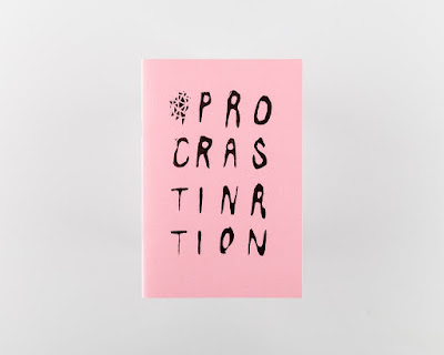
Procrastination Compilation George Mitchell
"Released to coincide with the release ofhis band, Eagull’s, second album ‘Ullages’, ‘Procrastination Compilation’ collects drawings by George Mitchell taken from one of his many sketchbooks filled as a distraction during the writing and recording of the album."
Published by Village
Design by Village
13 x 19 cm
Softcover
24 pages
Risograph printed in Leeds by Footprint Workers Co-op
Edition of 500
May 2016
Supported by Rough Trade and Partisan Records
This publication uses minimal colours effectively in different ways to produce an interesting visual. Images take up a full page, so that the full extent of the illustration is clear and dominant. Risograph printing is an environmentally friendly and cost effective method which can produce really interesting and different outcomes.
Nest (Leeds College of Art)
Own Photos
Nest is Leeds College of Art's student magazine, showcasing some of the colleges students art and design work. It is a small publication using Cyclus 100gsm for the main stock of the publication, I really like this stock as it is the right weight and feel. The matte effect also makes images muted with gives a nice tonal effect. The cover uses G.F Smith Colorplan Ebony in 270gsm, it only covers half of the publication which allows the image under to show through. The foiling on the front helps the publication to stand out, it gives it more glamour. This publication is bound by saddle stitch which is a cheap, quick way of binding, it also work effectively with the page count and the staples work through with the foiling. Within the layout of the publication white space has really been utilised however I think potentially it could have been overused and on some pages a more interesting layout could have been chosen.
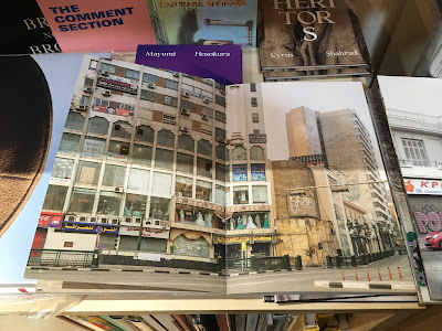
Cairo Diary - Peter Bialobrzeski
Own Photos
'Capturing Cairo between the overthrow of Morsi and Mubarak, Bialobrzeski’s images portray daily life in the Egyptian capital at a time of major urban, social and political upheaval and renewal. As silent and tranquil as they are anxious and tense, the images demonstrate Bialobrzeski’s ability to find beauty in chaos. The atmosphere is charged as we, the viewer, are left to contemplate what turn Cairo will take next.'
I loved the binding on this publication as coptic binding is something that I am exploring myself. Within this bind it also has been glued to provide extra support. It is an interesting and rustic approach. A matte stock was used which really works with the earthy brown tones within the images. I particularly liked the use of an image spread across a double page, as the viewer tends to pay closer attention to detail. This type of layout is something that I want to play around with and experiment myself to produce some interesting visuals.
May God Prosper It - Esther McManus
'A zine exploring notions of monasticism and pilgrimage, through the filter of a family holiday in the Peak District.
Riso-printed and hand-stitched, as a numbered edition of 50.'
The prints within this publication produced an attractive texture that engages with the viewer. The use of the brightly coloured inks helps to create a more striking design. Within this publication different sizes of stock has been utilised to create flaps, it helps to add more layers and different ways of viewing the prints. This is something that I will consider for my own publication as I I think it also helps to engage the audience, as my images are all of the same matter layout and stock size could become very important.
Looking at zines and going into The Village bookstore has really helped me with my research. I've seen methods of production that I think work well and ones that don't, as well gaining inspiration with some of the layouts.
RESOURCES:
WEB
- http://artmatters.ca/wp/2008/08/what-is-a-zine/
- https://www.behance.net/gallery/8312027/vizi-figate
- https://villagebooks.co/products/procrastination-compilation
- http://www.bialobrzeski.de/work/CairoDiary/Cairo_buch_51.html
- http://esthermcmanus.co.uk/May-God-Prosper-It


No comments:
Post a Comment