Figure - When the eye differentiates an object from it's surrounding area. It is also called a positive space. Recognisable objects are easy to see as figure.
Ground - Everything that is not figure is ground. It is the secondary portion of the design.
Active white space - When white space is done purposely.
Passive white space - Occurs naturally within the design.
We began to look at different magazines to see what there layout design was like:
The Skinny
Leeds student handbook 2015-2016

This publication has smooth matte paper giving a muted feel which let's the images speak for themselves rather than a the light drawing attention away from them. It also helps because there is a great deal of text so that works better on a matte finish. The magazine is A5 so there is a lot of content fitted onto the small pages. Although it is small they have utilised white space in certain ways, text and image is allowed ample room to breathe. This gives the magazine a cleaner more thought out design that is easier on the eye and easier for people to digest the information. It is follows a 2 column grid system, probably due to the fact that there isn't much page space but It does make it clearer, and the design seems more cohesive. There is also white space around titles which helps to add a statement and brings drama to what the article is about. Although the figures are very prominent the ground is very present within the design making it a very crisp design.
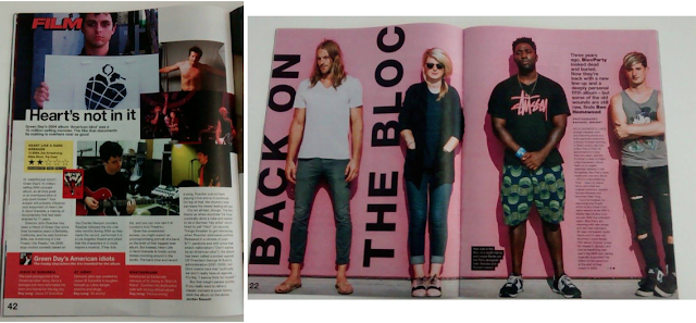
NME
Music magazine

This magazine seems to stick with a 4 column grid but it does not always stick within these constraints, as text and image at some point are suffocatingly close. This give an overcrowded feel but it tries to create more of a visual rather than a text heavy magazine. This also uses a matte paper which works well with pastel colours like the one used on the front cover. Figure is emphasised here by titles and images mainly giving the reader a more visual focus. What writing it does have works in most cases as the ground. White space has been utilised sometimes, but it is usually passive rather than active.


No comments:
Post a Comment