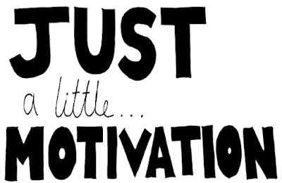
I found this which I could adapt and make my own. I think this is good because it helps bring more focus for students on this course and not being so general.
Motivational quotes I'm going to include:
- "Creativity is allowing oneself to make mistakes. Art is knowing which ones to keep."
- "The true sign of intelligence is not knowledge but imagination."
- "You can't use up creativity, the more you use, the more you have."
- "An essential aspect of creativity is not being afraid to fail."
- "To live a creative life, we must first lose our fear of being wrong."
- "The worst enemy to creativity is self doubt"
- "Creativity is seeing what everyone else has seen, and thinking what no one has thought."
- "To be successful the first thing to do is fall in love with your work"
To produce this I am thinking about doing my own type and arrangement because that might be easier than than trying to find a typeface that works for it and being hand drawn might draw more interest.
This is my own attempt at the type, I am going to take it into illustrator and use image trace to give the text a more refined stroke. I kept it in one long rectangular column as this would be used on the side of the bag.
This is my own attempt at the type, I am going to take it into illustrator and use image trace to give the text a more refined stroke. I kept it in one long rectangular column as this would be used on the side of the bag.
I added a white and black fill to some of the text to help give a more varied focus and have a higher contrast.
The problem that I can immediately see is that Im not sure all of the text is legible, such as the bottom right. However when applied onto the design and seeing it physically I don't think that it will effect it too much.
Because I had done hand drawn type for the sides of the bag I don't think the design would work cohesively if I changed to digital. Therefore I have decided to do all of the type hand drawn. This will give the product a more personal feel that will hopefully connect with a fresher, rather than the emotionless, corporate type that could have been done by anyone.
Title:
Back:
Flap:
Colour Scheme:
I have decided to keep the colour scheme simply black, working with different thickness's whether that be line or filled in. This way the brown paper can really show through and produce a nice harmonising effect.


No comments:
Post a Comment