OUGD405 Studio Brief 02 - Design Process - Information Design - Final Designs
After scanning in my drawings I added the type and colour in photoshop.
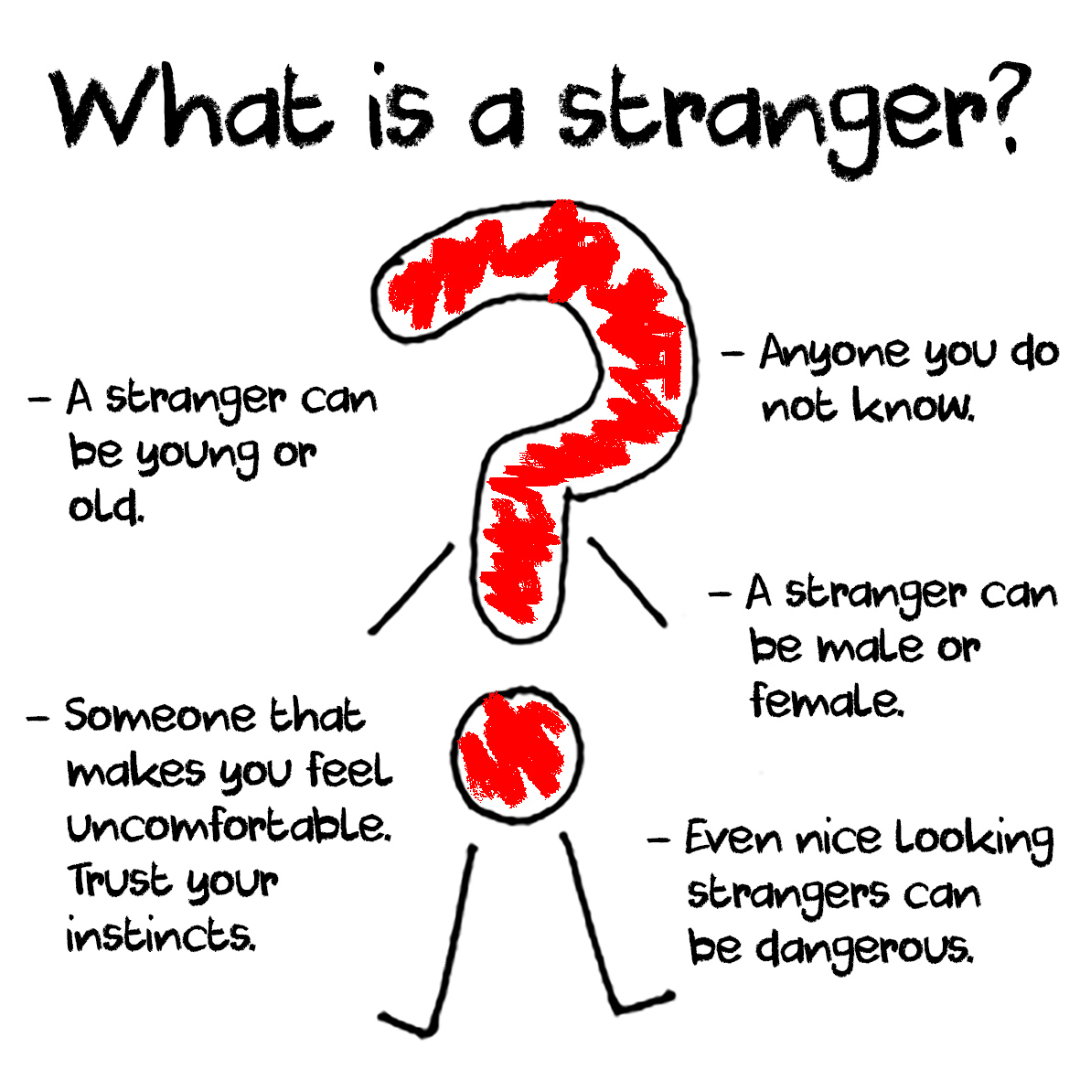
To colour in the characters I changed the effect of the pencil tool to match the same crayon effect as the type. I used pink (f49ac1) and blue (00bff3) as I felt the pale colours reflected a calming friendly presence. I also used red (ff0000) as this is an alarming warning colour. I kept all of my designs in RGB colour mode while designing. The reason I have chosen to design it in RGB rather than CMYK is because I have had another idea to further aid my campaign of doing a cartoon using the illustrations, therefore to match the colours it is beneficial to keep it in RGB mode.
I added the text at different angles around the illustrations I had created, I felt this gave it a less ordered more relaxed approach and something that a child would engage with more. Generally I left quite a lot of white space I had the idea in mind of children colouring and drawing on the leaflets which create's a deeper interaction.


No comments:
Post a Comment