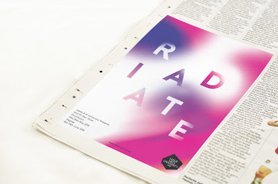
We managed to mock up all of the main collateral for our concept, to help envision what it could look like.
Posters:
We created 4 different background variations to show the different colour combinations, but the pink and purple design is the main poster visual.
Print Ad:
I mocked up how the ad would look in a magazine/newspaper.
Large Outdoor Ad:
I also mocked up how the design could be potentially displayed outside of the University.
Social Media Banner:
A mockup of how the banner could be applied across social media.
Flyer/postcard:
The front of the flyer shows the colour image with the name and the details. The back shows more detailed information with the original unedited image.
Online Graphics:
Courtney made a moving image where the background changes colour, to provide more engagement for the campaign.
Justification:
The overall concept embodies the values of LAU, in particular reflecting the diverse nature of the different courses and students through the use of colour and blurred images of work. The ambiguity of the visuals provides interest and intrigue to the campaign. The bright colours create an excitement and an engagement with the design providing striking visuals.
The consistent, bold type is clear and legible making it as accessible as possible. The placement of the type is playful and dynamic, visually representing the type radiating out from a central point. Weaving the type within the backgrounds helps to provide a succinct relationship with type and image. This ambiguity will attract a varied audience and attract the eye through the use of vibrant colour contrasts.
Including the original image on the flyer shows the story behind the abstract giving the viewer an insight into the end of year show as well as promoting the individual artists work.


No comments:
Post a Comment