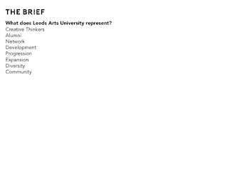
Evaluation:
This brief was challenging as we wanted to produce something different that was bright and engaging but while still reflecting the universities values. As a team we all worked together really well, we were working on another brief all together and that meant we had to manage our time effectively between the two projects.
This was a really good opportunity to work on a client led brief whilst gaining feedback from Peter and Paul studio. However, as we found out a long the way there were some communication issues where we were left confused, this tended to be through email. Face to face meetings were much more beneficial and there was understanding on both sides. This is important to realise now, that email isn’t necessarily the best form of communication for detailed and thorough feedback. I also found that meeting up with Daniel isn’t as nerve racking as I thought, as he was very easy going and friendly.
This brief has given me a lot more confidence working on a professional live brief as well as having to pitch to important people within the university. I have struggled with presenting so this was a perfect opportunity to gain more confidence. Although I was still nervous, having the rest of the team present with me really helped to support me and I know with more practice presenting my confidence will increase.
Although we didn’t win I am proud of what we managed to achieve as it was hard work trying to do multiple briefs at once. We managed to stick to a thorough time plan which meant we could benefit from as much of Daniel’s feedback as possible. Asking for feedback as much as we could really helped to shape the final design.
The overall design was a bit of a risk as it is very bold and vibrant but I think we did well to produce a well-rounded design. I also feel like I have managed to improve my skills working on Photoshop, applying the different background manipulations and trying to work with type in a more dynamic way.
Showing posts with label Brief 06. Show all posts
Showing posts with label Brief 06. Show all posts
Thursday, April 5, 2018
Wednesday, April 4, 2018
OUGD603 Brief 06: Final Feedback
Final Feedback:
Unfortunately the next day we were informed by Daniel that we didn't win the pitch. This was obviously disappointing, but we have all done really well to produce a good concept.

Unfortunately the next day we were informed by Daniel that we didn't win the pitch. This was obviously disappointing, but we have all done really well to produce a good concept.

OUGD603 Brief 06: Presentation
Presentation:
We presented our concept to a few of the tutors, Daniel, the marketing department, the vice chancellor and the chancellor of the university. We all took part in the pitch dividing up the different sections to talk about. This way everybody was involved and we all supported each other as a group. Unfortunately while we were doing the pitch the powerpoint lagged between slides but we tried to make sure we adjusted the way we spoke to minimise the long pauses.


We presented our concept to a few of the tutors, Daniel, the marketing department, the vice chancellor and the chancellor of the university. We all took part in the pitch dividing up the different sections to talk about. This way everybody was involved and we all supported each other as a group. Unfortunately while we were doing the pitch the powerpoint lagged between slides but we tried to make sure we adjusted the way we spoke to minimise the long pauses.


OUGD603 Brief 06: Final Designs
Final Designs:
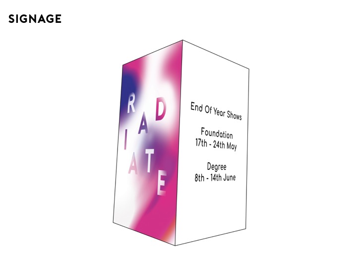
We managed to mock up all of the main collateral for our concept, to help envision what it could look like.
Posters:
We created 4 different background variations to show the different colour combinations, but the pink and purple design is the main poster visual.


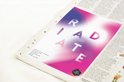
Print Ad:
I mocked up how the ad would look in a magazine/newspaper.
Large Outdoor Ad:
I also mocked up how the design could be potentially displayed outside of the University.

Social Media Banner:
A mockup of how the banner could be applied across social media.

Flyer/postcard:
The front of the flyer shows the colour image with the name and the details. The back shows more detailed information with the original unedited image.


Online Graphics:
Courtney made a moving image where the background changes colour, to provide more engagement for the campaign.
Justification:
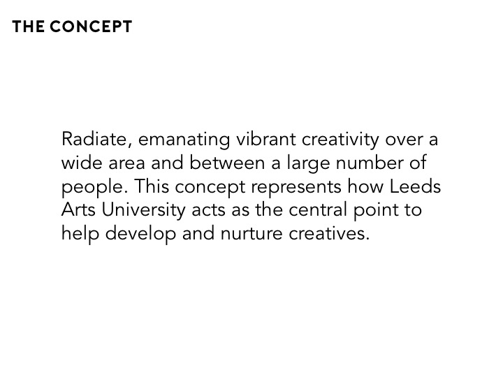
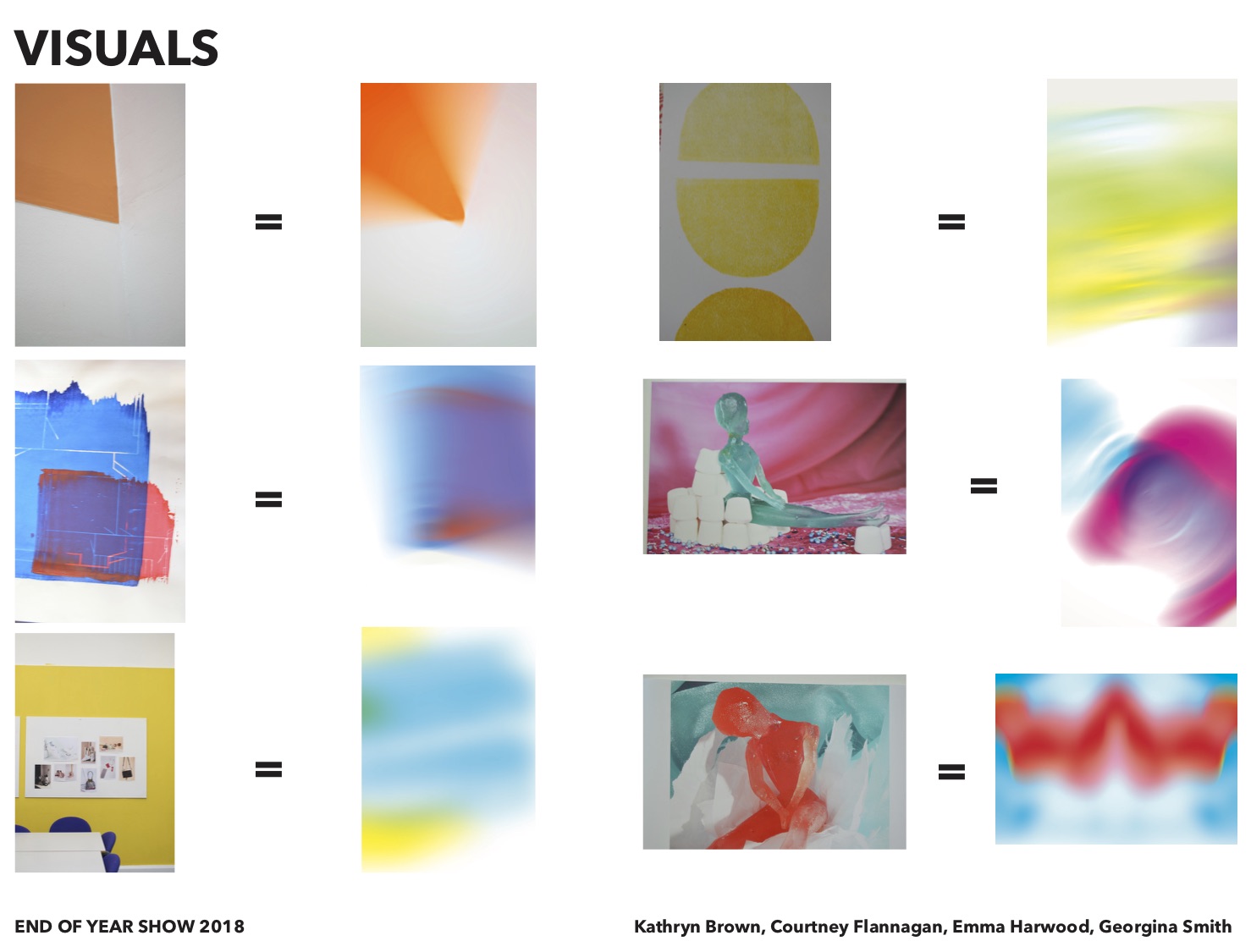
The overall concept embodies the values of LAU, in particular reflecting the diverse nature of the different courses and students through the use of colour and blurred images of work. The ambiguity of the visuals provides interest and intrigue to the campaign. The bright colours create an excitement and an engagement with the design providing striking visuals.
The consistent, bold type is clear and legible making it as accessible as possible. The placement of the type is playful and dynamic, visually representing the type radiating out from a central point. Weaving the type within the backgrounds helps to provide a succinct relationship with type and image. This ambiguity will attract a varied audience and attract the eye through the use of vibrant colour contrasts.
Including the original image on the flyer shows the story behind the abstract giving the viewer an insight into the end of year show as well as promoting the individual artists work.
We managed to mock up all of the main collateral for our concept, to help envision what it could look like.
Posters:
We created 4 different background variations to show the different colour combinations, but the pink and purple design is the main poster visual.


Print Ad:
I mocked up how the ad would look in a magazine/newspaper.

Large Outdoor Ad:
I also mocked up how the design could be potentially displayed outside of the University.

Social Media Banner:
A mockup of how the banner could be applied across social media.

Flyer/postcard:
The front of the flyer shows the colour image with the name and the details. The back shows more detailed information with the original unedited image.


Online Graphics:
Courtney made a moving image where the background changes colour, to provide more engagement for the campaign.
Justification:
The overall concept embodies the values of LAU, in particular reflecting the diverse nature of the different courses and students through the use of colour and blurred images of work. The ambiguity of the visuals provides interest and intrigue to the campaign. The bright colours create an excitement and an engagement with the design providing striking visuals.
The consistent, bold type is clear and legible making it as accessible as possible. The placement of the type is playful and dynamic, visually representing the type radiating out from a central point. Weaving the type within the backgrounds helps to provide a succinct relationship with type and image. This ambiguity will attract a varied audience and attract the eye through the use of vibrant colour contrasts.
Including the original image on the flyer shows the story behind the abstract giving the viewer an insight into the end of year show as well as promoting the individual artists work.
OUGD603 Brief 06: Deciding on the Final Design
Deciding on the Final Design:
Based on Daniels Feedback we knew that the type was heading in the right direction but we needed to make a decision whether we were going to have the white overlay or the blending of the text. I decided to go around the room showing about 10 of my peers both mine and Emmas design to help decide on the direction.
Feedback:
Overall people preferred Emma's design as they felt that it was more legible than the hidden text. The white overlay made the text stand out and made the overall design appear more dynamic and interesting. However, it was felt that the white overlay was too stark a contrast and that the edge should be softened so that it blends into the background more. They also liked how on my design the letters were hidden partially into the background. It was therefore suggested to combine both methods so that background image and text flowed and worked together seamlessly.
Based on this feedback me and Emma set about to change the designs combining both elements.
Tuesday, April 3, 2018
OUGD603 Brief 06: Meet Up With Daniel
Meet Up With Daniel:
Following Daniels emails me and Emma started to work further on the type to see how we could make the design more engaging.
My Designs:
Posters


Flyer


I decided to start again with the backgrounds and this time try and make them as bright and colourful as possible. Then based on the image of the type which is hidden, I tried to make it look like the colours were smoking round the letters. This way the background and the type worked together to produce a more visually appealing design.
Emma's Design:

Emma started working with an abstract shape which the letters would be cut out from, to add an extra element to the design.
Daniels Feedback:
Overall Daniel seemed a lot more positive with our concept than we had thought and he agreed that some of the ideas he suggested would probably be unrealistic within the time constraints. He liked the direction of both designs and wanted us to work on them further, he wanted us to find a middle ground between the harsh white overlay and the colour overlay to produce a strong cohesive design. He also noted that if we were struggling with a strap-line it would be best to leave it out as this could always be developed by them later on. Daniel also repeated this notion of how we had got to the abstract image and why, he suggested maybe showing the original image and then it gradually turning into the blurred abstract image. This is something we need to consider as we understood it would bring a greater level of understanding as to what our concept is about.
Following Daniels emails me and Emma started to work further on the type to see how we could make the design more engaging.
My Designs:
Posters


Banners


I decided to start again with the backgrounds and this time try and make them as bright and colourful as possible. Then based on the image of the type which is hidden, I tried to make it look like the colours were smoking round the letters. This way the background and the type worked together to produce a more visually appealing design.
Emma's Design:

Emma started working with an abstract shape which the letters would be cut out from, to add an extra element to the design.
Daniels Feedback:
Overall Daniel seemed a lot more positive with our concept than we had thought and he agreed that some of the ideas he suggested would probably be unrealistic within the time constraints. He liked the direction of both designs and wanted us to work on them further, he wanted us to find a middle ground between the harsh white overlay and the colour overlay to produce a strong cohesive design. He also noted that if we were struggling with a strap-line it would be best to leave it out as this could always be developed by them later on. Daniel also repeated this notion of how we had got to the abstract image and why, he suggested maybe showing the original image and then it gradually turning into the blurred abstract image. This is something we need to consider as we understood it would bring a greater level of understanding as to what our concept is about.
OUGD603 Brief 06: Daniels Feedback
Daniels Feedback:
Daniels Email
'Hi All,
Thanks for this.
I think that now referencing the work makes the idea stronger.
My only issue now is how we get to the blurred image itself.
I’m guessing you are using photoshop?
I wonder if there is a more interesting way to abstract the image with slightly more interesting results.
Or perhaps theres a way of merging the absract imagery to make something more dynamic?
Could you make a long exposure of a spinning artwork, or manipulate the artwork in a different way?
I think as it stands it’s a nice to look at but it really needs to be engaging and exciting, and really have a story behind it.
Could you paint students faces and make a long exposure of them instead of work like the below? Or with work even?
The other element the name again is ok but could it be more relevant to the visual AND work to talk about the exhibition.
Maybe expose or exposure would work better?
I’m coming over to the uni tomorrow afternoon to go over the development and I’ll outline step by step the presentation template that needs to be completed for next Monday night and what to focus on in the time you have left. Are you available at 5.00pm?
Feel free to send me anything in the meantime.
Thanks,
Dan.'
After receiving Daniel's feedback we were slightly confused with what he was asking us to do. We were running out of time to produce the pitch and only had a few more days to finalise things. We didn't feel that we could change the direction of the project too much within the final few days.
Our Reply:
'Hi Daniel,
Thanks for your feedback.
Due to time constraints and our group feelings, we think that the imagery suggestions would be unable to be produced within the time that we have. We also think that using photographs of students takes the focus away from the work and draws attention towards the 'unknown' individuals that would be blurred in the image.
In terms of the imagery being more dynamic, could you expand on this? Are you referring to shape? colour? positioning?
We are shooting a video between 3:30 and 20:00 tomorrow. Some members of the group will be able to meet you but it would be great to also get this information emailed through if possible?
Thanks,
Kathryn, Courtney, Emma & Georgina'
Daniel:
'I’ll be coming over to your campus so just outside the graphics room will be fine.
Think as it stands, the graduated colour feels nice but doesn’t blow me away visually.
Theres a danger for the campaign to feel like just a photoshop effect, rather an exciting campaign.
If you are unwilling to try and achieve the effect in a different way, is there a more interesting way to combine the abstract colours.
Could the colour mist weave in and out of the type?
I just think there needs to be another layout consideration to make the work more intriguing and eye-catching.
Also what did you think to the name change?
Thanks,
Dan.'
We did understand what Daniel was saying about it just looking like a photoshop effect, but we were struggling to think how we could improve this. We decided that focusing more on the typography to produce a more engaging design could be the way forward.
Daniel then did send through some further imagery as I think he could sense we weren't quite understanding what it was he wanted us to do with the design.


He seemed to want us to create more of a cohesion with the background and the type, so that they work together. We all decided that we would work further with the type to merge it into the background in an interesting way, before we meet up with Daniel.
As a group we have found it difficult to communicate with Daniel over email as we couldn't quite understand what he was trying to tell us, hopefully when we meet in person it will provide further clarity.
Monday, March 12, 2018
OUGD603 Brief 06: 12th March Developments
12th March Developments:
We all met up to look through the experiments that we have done individually based on Daniels feedback. We then decided which design were our favourite and put together the presentation as Daniel specified.


Hopefully we receive feedback from Daniel quickly to be able to take a concept forward and plan what else we are going to do for the campaign.
Subscribe to:
Posts (Atom)