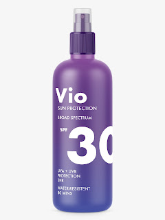
From the feedback I received I have started to adjust the design playing around with type size and putting the text closer together whilst keeping the layout the same.
Feedback:
- Resistant has been spelt wrong so needs changing
- Preferred the smaller logo - felt that it works more appropriately
- Preferred the logo and the '30' at a similar size so that when people become more familiar with the brand that will be the first thing that look for.
- Close gap between 'sun protection' and 'broad spectrum'
Based off this I have made adjustments to the last design as I feel that this is the most appropriate.


No comments:
Post a Comment