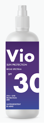
Colour:
The concept for this brand is based around ultra-violet light, so for the colour palette I want to use violet as the main colour.
I found an ultra-violet colour palette online which I want to work from:
These colours are what they would look like in RGB. The shades appear slightly different in CMYK, with more muted tones.
I think working with a coloured gradient as the background could look really striking.
Gradient:
I haven't ever used the gradient tool in illustrator before so I will need to learn how that works and have a play around with it first.
As I started to understand better how to use the tools my gradients started to get a lot better.
Examples on bottle:
Feedback:
I asked one of my peers which gradient background they preferred, which was number 3. They felt that the lighter area helps to highlight the name of the brand more and has a more diverse design due to the different colours in the gradient.


No comments:
Post a Comment