Shortlisted:
To my surprise I have been shortlisted for the competition, I have been sent all of the submission information for the next stage in the process.
IDENTIFICATION
Each entry has been allocated an entry number. The given entry number must be clearly marked on each entry using small self-adhesive labels placed discreetly on each pack, and in hand writing at the top right hand corner of the back of each board.
Please ensure that each entry number is also written on the outer container used for transport.
MODELS AND BOARDS NOT MARKED WITH THE ENTRY NUMBER WILL BE DISQUALIFIED.
Please do not attach the labels in such a way that they would show if photographed/displayed as an award winning entry.
Do not put the student's name on the work.
CONSIGNMENT & DELIVERY
Entries, clearly marked as above should be sent to
STUDENT STARPACK AWARDS (your entry number):
IOM3
72-73 Warren Street
London
W1T 5PE
Delivery must be made between 9.00 am and 5.00 pm on 30 April - 4 May.
JUDGING ARRANGEMENTS
Judging will take place on 9 May, during which time no persons other than the judging panel, sponsors and IOM3 staff will be admitted to the site. No telephone calls concerning entries will be accepted.
RESULTS
Results will be available late May - please bear with us while we collate the results before getting in touch with you.
RETURN OF PACKS
It is your responsibility to arrange for the work to be returned, either by supplying stamps, organising a courier via your tutor, or personally collecting. All uncollected work will be disposed of by 18 May.
INSURANCE
The organisers cannot accept responsibility for any loss or damage of packages and entrants should, if required, take out their own insurance cover for their packs.
PRESENTATION OF STARPACK AWARDS
The awards presentations will take place on 27 June 2018 in London.
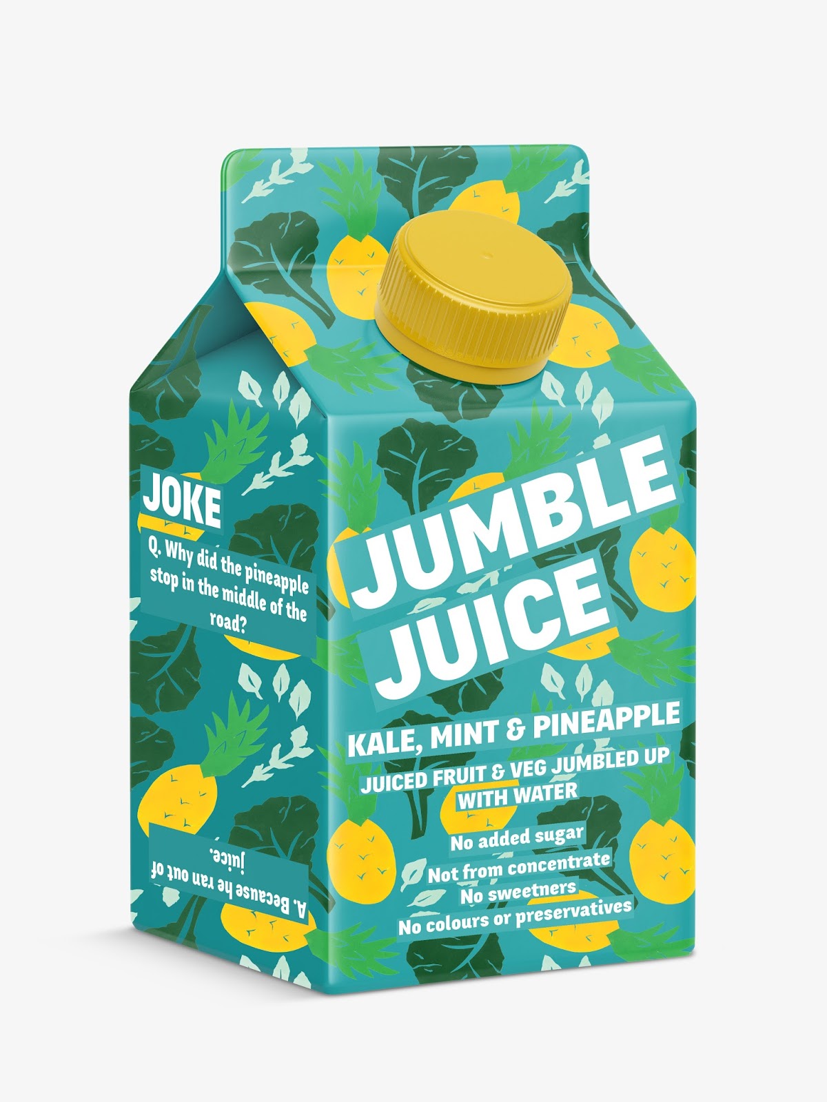
Re-print:
I have noticed that the pattern is in different positions on all three nets. I need the design to be consistent across all three so I am reprinting the design before I send it off.
Saturday, May 12, 2018
Tuesday, May 8, 2018
OUGD603 Brief 08: Final Designs
Final Designs:
Edited Mockups:
I have decided to add a light blue background so that the white of the type stands out more.
Potential ad mockup:
I have decided to add a light blue background so that the white of the type stands out more.
Potential ad mockup:
OUGD603 Brief 09: Feedback
Feedback:
After showing my designs to another one of my peers they suggested changing the colour of the boxes around the text to the same colour as the background. This was because the green was too similar to that of in the pattern.
I think this works a lot better at making the text stand out, being a lot clearer and more legible. It also works more harmoniously with the design.
Monday, May 7, 2018
OUGD603 Brief 09: Side View
Side View:
I need to work out what I want to put on the side of the carton that kids can interact with. I think that putting either a little puzzle or game could work effectively, or even jokes.
Fruit & Veg Jokes:
Orange:
- Why did the orange stop? Because it ran out of juice.
- Why did the man at the orange juice factory lose his job? He couldn't concentrate.
Apple:
- How do you make an apple turnover? Push it down a hill.
- When is an apple a grouch? When it's a crab apple!
- What do you call an apple that plays the trumpet? A tooty fruity.
- What did the apple skin say to the apple? I've got you covered.
Pear:
- What are twin's favourite fruit? Pears.
Carrot:
- What's a Vegetable's favourite martial art? Carrotee!
- Did you hear about the carrot detective? He got to the root of every case.
Pineapple:
- Why did the pineapple stop in the middle of the road? Because he ran out of juice.
- What kind of fruit do trees like the most? Pine-apple
Testing out type placement:
I think that the 'Joke' works better straight in line with the rest of the text.
Adding the joke onto the side provides more interaction with the packaging. It also helpt to break up the pattern.
OUGD603 Brief 09: Mockup Testing
Mockup Testing:
I have decided to buy a mockup so that it will look more professional. I have gone for a small juice carton with a resealable lid. This is different from what is on the market, being card it can easily be recycled and having a resealable lid is also really useful.
Pattern:
It was quite difficult to sort the pattern as I need to make sure it joins up on each side. I have managed to sort it out as there is a clipping mask over the shape which has allowed me to easily apply the pattern.
Pineapple Mockup:
I have mocked it up with the pattern which I think works really well, however now that I have added the type the smaller type isn't as legible.
Increasing small text size...
Increasing the text size has helped to make the smaller text stand out. This text doesn't need to be legible from a distance only the brand logo needs to be see from a distance.
I noticed that the pattern isn't exactly working with the 3D shape where the carton folds in on the left. I've cut half of the pineapple off so that it works more effectively. I have also increased the type size again so that it is more legible.
Apple Lemonade:
Pear, Carrot and Orange:
Feedback:
Showing my designs to one of my peers, they weren't sure about the smaller text being similar to the 'Juiced fruit...'. They suggest trying a different typeface which looks more like copy text - just to differentiate between the information.
Responding to Feedback:
I changed the smaller type to lowercase and put each text only on one line. This works a lot better as the hierarchy of information is a lot clearer.
OUGD603 Brief 09: Type Placement & Colour
Type Placement:
I tested out different type placements working with just black texts, I then applied the background to see if it worked well with the pattern.
Black text doesn't work that well on the background making it harder to read and less legible.
My favourite two:
I like these two placements as the brand is big and bold, helping it to stand out. The 1st design has the brand name at a slight angle which helps to add more movement. The second design is clear and bold. Both designs show the important information clearly on the front.
Colour:
I think that the text works nicely white as it seems bright, healthy and engaging. However, it isn't that legible, potentially adding an outline could make it stand out more against the background.
This has helped a little bit but the text still needs to stand out more.
I tried putting a shape with a low opacity to tone down the pattern and make the text stand out more. I think that a white overlay works better as the black tones down the pattern too much.
I added squares behind the text to help it stand out against the busy pattern, I think this works but I think black might be too start a contrast.
I've decided to go for the design with the slanted logo as I feel that it helps to give off a more friendly and fun feel. The green seems to work the best at helping the text stand out but also working effectively with the pattern.
Saturday, May 5, 2018
OUGD603 Brief 09: Background
Background:
Now that I have the illustrations from meg I need to decide whether to put them on a coloured background or just go for white.
The coloured backgrounds provide a good contrast which makes the fruit stand out. A blue background might be more appropriate as the juices will be mixed with water. All of the patterns work really well on the blue background as well, providing a strong, vibrant colour contrast.
Blues:
I think that my favourite blue are the first one due to the high vibrant contrast and the third design being more cohesive.
Feedback:
Showing the combinations to one of my peers they preferred the 3rd design as it was slightly warmer giving off a friendly and inviting tone. The colours still contrast well but there is more harmony in the overall combinations.
Subscribe to:
Posts (Atom)